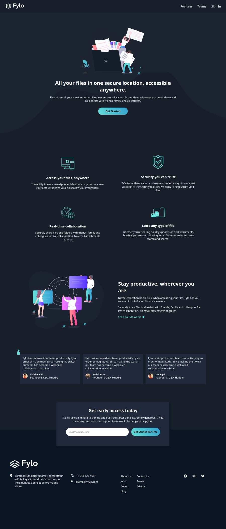
Mobile-first Fylo Landing Page using HTML and SCSS with layouts
Design comparison
Solution retrospective
This is a re-upload
My 5th Junior Project!
I had a lot of fun creating this one. I think I literally fell in love with the color palette and the beautiful images provided. So, I decided to work happily on this one!
This is actually my first time using SCSS for a project on the website. I'm really happy how it turned out because it took me 2 days to complete it. I think I have put some effort to make the elements accessible to everyone! I hope it works well on your devices.
This one did help me make use of my CSS grid and flex layouts. I think this is one of the longest projects I have done so far!
I think I had almost no challenges here except getting the paddings right. But I managed to get it close to the design. I had spent some time on the Footer because, I didn't understand the layout quite right. But, after I had an idea about it, I managed to create it with ease.
There were some mistakes in the path of the image, some layout errors and some minor things. I got around these on my own and I'm proud of that!
What specific areas of your project would you like help with?I would like to know how responsive it is and how accessible it is. I would like to know how I can improve my CSS as well as my HTML.
Any recommendation on how I can improve are welcome!
Community feedback
Please log in to post a comment
Log in with GitHubJoin our Discord community
Join thousands of Frontend Mentor community members taking the challenges, sharing resources, helping each other, and chatting about all things front-end!
Join our Discord
