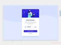
Design comparison
SolutionDesign
Solution retrospective
I did not have any particular difficulty for this project. But if you have any comments, let me know :)
Community feedback
- @FluffyKasPosted about 3 years ago
Hey, your solution looks good! Few things I noticed:
-
The background image doesn't work in desktop view.
-
A
cursor: pointerwould look nice on the button. -
You use IDs but actually simple classes would do the job just as well.
Marked as helpful0@CarolineSenesPosted about 3 years ago@FluffyKas
- The background works up to 1440px which is the maximum resolution of the image. In order not to have it cut, I chose to remove it after 1440px.
- Thanks for the button cursor! 👍 I fixed it.
- You're right! 😆 I changed the ID to Class.
0 -
Please log in to post a comment
Log in with GitHubJoin our Discord community
Join thousands of Frontend Mentor community members taking the challenges, sharing resources, helping each other, and chatting about all things front-end!
Join our Discord

