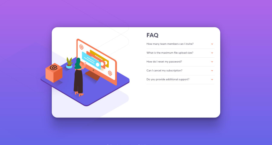
Mobile-first FAQ card using only Sass (+ trying with BEM)
Design comparison
Solution retrospective
As I have anticipated before tackling this, I had the most trouble with stacking the illustration SVGs without breaking the layout of the accordion. In terms of the desktop layout, since I have all of my illustration SVGs in the same wrapper container, I wasn't able to hide the background patterns and the woman-interacting-with-display illustration (since it overflows the FAQ card) without also cropping out the box SVGs at the same time, so any guidance on that particular part (and also advice in general) is greatly appreciated!
Community feedback
- Account deleted
Hi, good job on completing the challenge.
Your solution works, and is quite functional. Your should center the text horizontally in the container, rather than having a huge space at the bottom of it. And if you open multiple tabs the box ends up moving, so It'd be best to incorporate the 'one tab at a time' functionality to avoid it.
Keep coding👍.
Marked as helpful1
Please log in to post a comment
Log in with GitHubJoin our Discord community
Join thousands of Frontend Mentor community members taking the challenges, sharing resources, helping each other, and chatting about all things front-end!
Join our Discord
