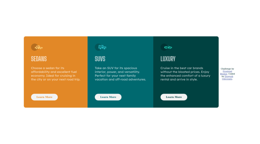
Design comparison
Solution retrospective
Hey, I'd be happy to hear what I did wrong in my design, especially about the media query part, I don't know how to improve it, it's messed up a bit. Thank you
Community feedback
- @pikapikamartPosted over 3 years ago
Hey, awesome work on this one. Layout in desktop seems fine, the responsiveness could be better since right now, the container shifts based on the text-wrapping right. The mobile layout could use some more
width.Grishmita already said some useful feedback, just going to give some suggestions as well.
- Always have a
mainelement to wrap the main content of the page. The.containerselector could have usedmaininstead ofdiv. This way, contents are inside a landmark element. - Avoid using
height: 100vhon a large container like your.containerselector. This limits the element's height based on the screen. Usemin-height: 100vhinstead, this takes full height as well but allows the element to expand if needed. - For this one , I would put the
.attributioninside thefootertag, so your markup should look like:
<main /> <footer />- Avoid using multiple
h1on a page. Use only at least 1h1, change those intoh2. But in a page, you need anh1for this one, you will make theh1a screen-reader only text by having ansr-onlystylings. This means, the text will be hidden visually but visible for screen-readers. Theh1text-content should describe what is the content of themainis all about. Have a look at Grace's solution on this one inspect it and see how she used theh1and copy as well the styling applied on it, you will used that a lot. - Each car icons could use
aria-hidden="true"attribute so that the image will be visible for all tech. - Lastly, just those that I mentioned at the beginning, the responsiveness and mobile layout.
Aside from those, great work again on this one.
Marked as helpful1@dragoshcodePosted over 3 years ago@pikamart thank you so much for this code review 💛 took down the notes ✍
0 - Always have a
- @GrishmitaPosted over 3 years ago
I am not an expert but i have recently finished this challenge while. coding for frontend make sure to code the solution close to the given challenge as possible 1)padding
2) giving height to your div 3) regarding media query just understand whats the meaning of min-width and max-width after that there is a online media query breakpoint generator which are very cool and very helpful . From that website you can surely learn about media queryMarked as helpful1@dragoshcodePosted over 3 years ago@Grishmita Thank you so much! This website is awesome.
0
Please log in to post a comment
Log in with GitHubJoin our Discord community
Join thousands of Frontend Mentor community members taking the challenges, sharing resources, helping each other, and chatting about all things front-end!
Join our Discord
