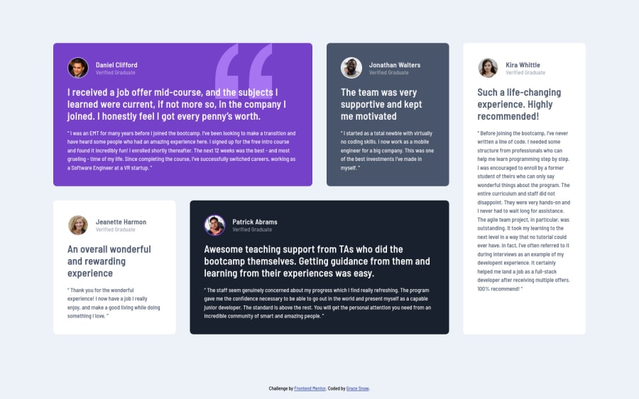
Mobile-first CSS grid layout, with scss, and flexbox in card headers
Design comparison
Solution retrospective
This is designed to be a guide for one way to do this challenge mobile-first, using scss variables and some more advanced css techniques like nth-child.
I used a VS Code extension to compile the scss.
Note: In a real project I would work with the designer to fix the accessibility issues or color contrast and font sizes.
Any questions or suggestions are welcome.
Community feedback
- @ApplePieGiraffePosted about 4 years ago
Hey, sweet job, Grace! 👍
Everything looks good! 👌
A small detail from the original design you might want to add would be the box-shadow around the testimonial cards. 😉
Happy coding! 😁
Marked as helpful1@grace-snowPosted about 4 years ago@ApplePieGiraffe thanks, totally forgot about those, you're right!
0 - @ahmed520bPosted about 3 years ago
That was the cleanest markup I've ever read on Frontend Mentor!
I'd be so happy if you point out my 'bad practices' or my weaknesses in my solutions.
And also give me advice on how to write 'classes' because I struggle a lot with choosing CSS classes and staying consistent!
1@grace-snowPosted about 3 years ago@ahmed520b it doesn't look like you've submitted any solutions yet?
0@ahmed520bPosted about 3 years ago@grace-snow I guess I have a problem! Even tho I’ve submitted my solutions and when I go to the challenges page, it shows that I’ve completed the challenge, but when I go to my profile I DO NOT FIND THEM!!
Anyway, you may check my github account and you’ll find the repos there :)
https://github.com/ahmed520b
Thanks in advance ✨
0 - @rfilenkoPosted about 4 years ago
Hi Grace, congrats, clean and nice code, almost perfect to me 😉
Cheers, Roman
2 - @emestabilloPosted about 4 years ago
Looks good Grace! Been waiting for you to come out with one 😅 The hidden heading for accessibility is a great addition I might just copy it lol.
1@grace-snowPosted about 4 years ago@emestabillo haha, thanks. I copied it from somewhere years ago probably! I pretty much use in every project I work on (I think it can be a bit shorter these days tbh, but it works so I've not bothered investigating)
1 - @bexicaaaPosted almost 4 years ago
Hey Grace why did you put everything inside of a blockqoute? Is it possible to use div instead? :)
0
Please log in to post a comment
Log in with GitHubJoin our Discord community
Join thousands of Frontend Mentor community members taking the challenges, sharing resources, helping each other, and chatting about all things front-end!
Join our Discord