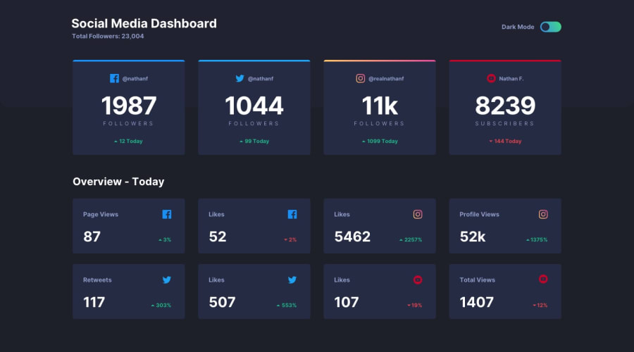
Design comparison
Solution retrospective
It was the first time I've used BEM and CSS grid so any feedback regarding those is much appreciated.
Community feedback
- @WronskiNPosted over 4 years ago
In overall your solution looks good for me :).
However, what I would change:
I would add classes for some of html tags like h3 or span and style them with using classes.
In terms of the Grid style. On some screens the columns sets not same as on the project view. I would add for class .card-container { grid-template-columns: repeat(4, 1fr)} for bigger screens > 1024px;
Good job!
2@jakubzajacPosted over 4 years ago@WronskiN Thanks for your feedback! You're absolutely right about using classes instead of HTML tags in my CSS - this was my first attempt at BEM so it's great to learn another good practice. I'm also gonna have a look at the grid issue you mentioned.
Thanks again and good luck with your challenges!
0
Please log in to post a comment
Log in with GitHubJoin our Discord community
Join thousands of Frontend Mentor community members taking the challenges, sharing resources, helping each other, and chatting about all things front-end!
Join our Discord
