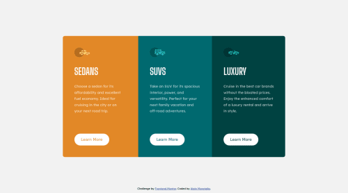
Mobile-first approach, responsive SCSS 3-column preview card component
Design comparison
Solution retrospective
Hello everyone, I am open to suggestions or any forms of feedbacks to improve my skills. Please feel free to share if there any points that I can improve or tips for best practices that I can follow. Any form of remarks will be highly appreciated. Thank you!
Community feedback
- @folathecoderPosted over 3 years ago
Hi Alain!
Your page is giving an "Error 503 Service Unavailable" prompt. Kindly fix it!
2@almoratallaPosted over 3 years ago@folathecoder Hi, thank you for this. The page currently works on my end.
The Error 503 encountered may have been a temporary issue as it is hosted on my github page.
Thank you and have a great day!
0 - @ApplePieGiraffePosted over 3 years ago
Hey, Alain Moratalla! 👋
Congratulations on completing your first Frontend Mentor challenge! 🎉 Good work on this one! 👍
The card component looks good and is responsive! 🙌
I suggest only using one
<h1>
tag per page (since it is recommended that there only be one most important heading on a page). In this case, a less-important heading tag (such as<h3>
) for the headings of each of the sections of the card component might work better. 😉Keep coding (and happy coding, too)! 😁
1@almoratallaPosted over 3 years ago@ApplePieGiraffe Hey ApplePieGiraffe,
Thank you for your thoughts and suggestion. Will definitely keep in mind your suggestion of using one
h1
tag per page and a less-important heading tag per section! 🎉Appreciated your comment. Hope you have a great day!! 😁
0
Please log in to post a comment
Log in with GitHubJoin our Discord community
Join thousands of Frontend Mentor community members taking the challenges, sharing resources, helping each other, and chatting about all things front-end!
Join our Discord