


Design comparison
SolutionDesign
Solution retrospective
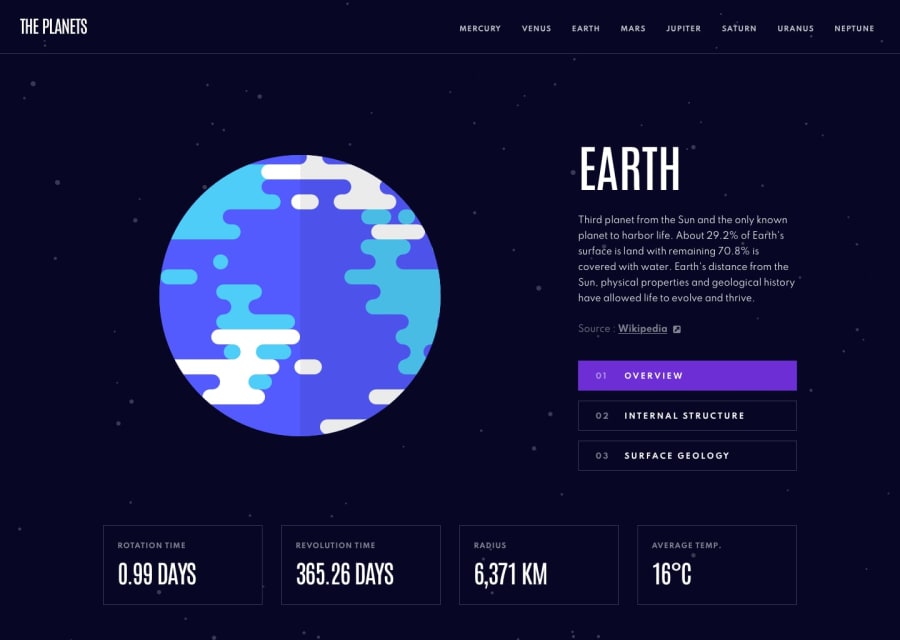
The website gave me tough time, i use different approach in development. Each page route has its own css.module file, first time using this approach. some of the things i could not do found them tough,
- like border-top on active navlinks in top navigation.
- positioning small surface image at the bottom center of the planet image ,
- mobile menu navigation can scroll from behind. and many more
im still new in react-router, any feedback will be appreciated.
tools i used -Grid (grid-template-area) for the hero layout -flex for navbar -NavLink for active navigation Outlet BEM BrowserRouter , Routes, Route
Any Feedback will be appreciated.
Community feedback
Please log in to post a comment
Log in with GitHub
Join our Discord community
Join thousands of Frontend Mentor community members taking the challenges, sharing resources, helping each other, and chatting about all things front-end!
Join our Discord