Not Found
Not Found
Not Found
Not Found
Not Found
Not Found
Not Found
Not Found
Not Found
Not Found
Not Found
Not Found
Not Found
Not Found
Not Found
Not Found
Not Found
Not Found
Not Found
Not Found

Submitted

Mobile-first 3 Column preview card

Marcos 95

@marcosfsousa

Desktop design screenshot for the 3-column preview card component coding challenge

This is a solution for...

  • HTML
  • CSS
1newbie
View challenge

Design comparison


SolutionDesign

Solution retrospective


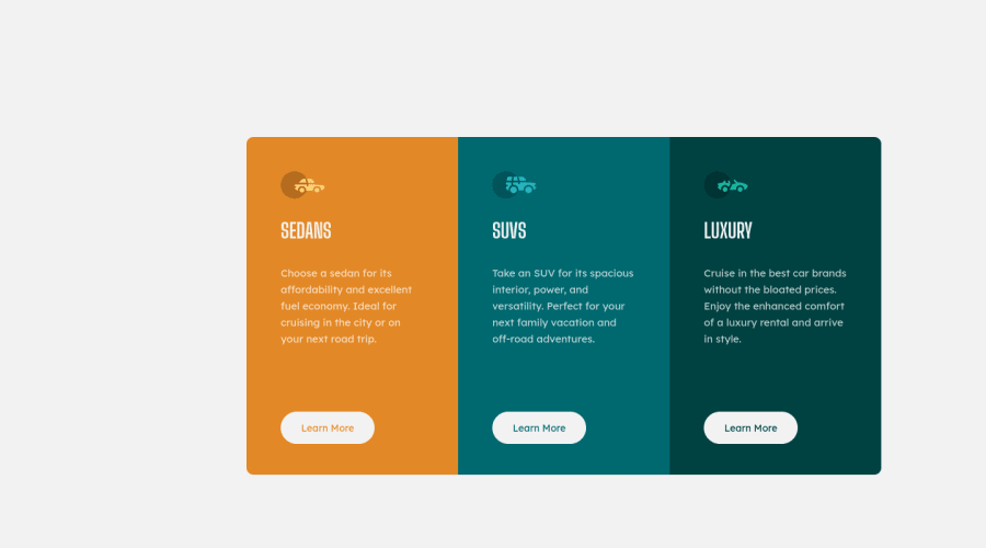
I noticed a small 'artifact' that present itself when clicking the buttons which adds a 1px border outline. It resizes the cards height ever so slightly. I think it's due to how flexbox calculates the spacing for each item. I couldn't find a way around it.

Updated solution: Refactored breakpoints and margins.

Community feedback

T
Grace 29,310

@grace-snow

Posted

In html I recommend you

  • change h1s for h2. Optional but in all liklihood this component would exist on a page with a heading so h2 would be better hierarchy
  • remove alt values and leave the attributes empty instead, as these are meaningless images that can be ignored by screenreaders and bots. Then look up how to write alt text well for future challenges where you'll need to.
  • change buttons for anchor tags. These would trigger navigation, not perform an action like toggling content.

Happy coding

Marked as helpful

1
T
Grace 29,310

@grace-snow

Posted

All you need is a border on the buttons to fix that layout shift. Make it the same color as the btn background or make it transparent. Either way, that tells the dom how high it needs to be, it's unrelated to flexbox

Marked as helpful

1

Letlotlo 60

@LT-WebDev

Posted

@grace-snow Thanks for this input - I too am busy with this challenge and had the same problem. Your input helped fix my problem ;).

Thanks again. LT

0
Faris P 2,810

@FarisPalayi

Posted

Nice job on this one👍

You can fix that by giving a fixed height to cards.

  • Use cursor: pointer to buttons to better indicate interactivity.
  • Also, try to use a smaller media query breakpoint, because even though I'm using my laptop to see the solution, I'm getting the mobile version of the site.

Have fun coding 👍

Marked as helpful

1

Marcos 95

@marcosfsousa

Posted

@FarisPalayi Thanks for the input, Faris. I have cursor: pointer on the active states of the buttons, but I agree that before they are clicked they should hint to the user they are indeed interactable.

I added some more breakpoints as you hinted.

Thank you for taking the time to reply to the project.

1
P
Patrick 14,285

@palgramming

Posted

you should change your .card-container margin to margin: 70px auto;

Marked as helpful

0

Marcos 95

@marcosfsousa

Posted

@palgramming Thanks for the input Patrick. Updated my solution and inserted your helpful hint.

0

Please log in to post a comment

Log in with GitHub
Discord logo

Join our Discord community

Join thousands of Frontend Mentor community members taking the challenges, sharing resources, helping each other, and chatting about all things front-end!

Join our Discord