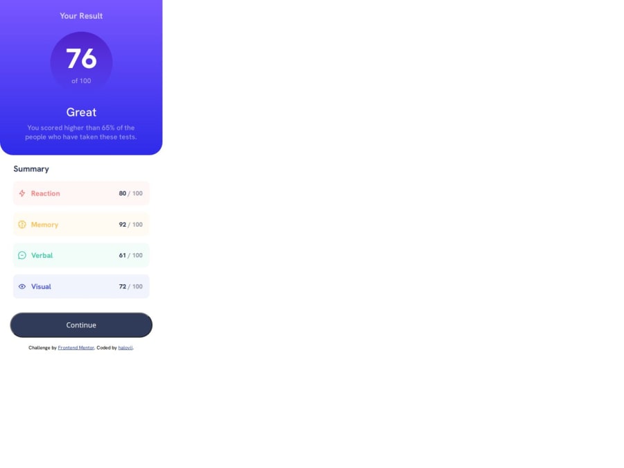
Design comparison
Solution retrospective
I'm trying to learn how media queries and responsive web design work so I attempted the mobile version first, however I struggled to actually achieve the responsive design so instead I duplicated the folder and coded the web version separately. Hopefully in the future I'll overcome this and figure out how responsive design works!
Community feedback
- @Axsel519Posted 5 months ago
Use of media query
/* Extra small devices (phones, < 576px) / @media (max-width: 575px) { / Styles here */ }
/* Small devices (landscape phones, 576px and up) / @media (min-width: 576px) and (max-width: 768px) { / Styles here */ }
/* Medium devices (tablets, 769px and up) / @media (min-width: 769px) and (max-width: 991px) { / Styles here */ }
/* Large devices (desktops, 992px and up) / @media (min-width: 992px) and (max-width: 1199px) { / Styles here */ }
/* Extra large devices (large desktops, 1200px and up) / @media (min-width: 1200px) { / Styles here */ }
Marked as helpful1 - P@RopenfoldPosted 5 months ago
Look at Flexbox when working with responsive queries, I particularly find the wrap element to be the most useful. Also work with @media queries in css, I use the following 2 options for Tablet and desktop: Tablet: @media (min-width: 768px) and (max-width: 1023px) {}
Desktop: @media (min-width: 1023px) { }
Marked as helpful1
Please log in to post a comment
Log in with GitHubJoin our Discord community
Join thousands of Frontend Mentor community members taking the challenges, sharing resources, helping each other, and chatting about all things front-end!
Join our Discord
