Submitted over 3 years ago
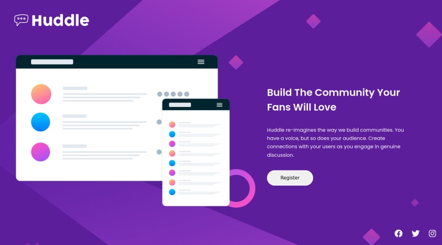
Mobile Responsive Huddle Landing Page with HTML and CSS
@roguepanther
Design comparison
SolutionDesign
Solution retrospective
Thoroughly enjoyed working on this project, there are a few things I want to tweak to ensure it looks immaculate, but any feedback regarding the site will be super appreciated as I want to learn as much as possible. Cheers guys.
Community feedback
- @muhammadshajjarPosted over 3 years ago
Hi, Nice effort on this challenge!
I would like to add some points
- Always have a
mainelement on a webpage. This helps users navigate properly within your site. In your case,<div class="container">should wrap inmain. It also overcomes accessibility issues on your page. - Don't write
href=" "in a button, instead useaif there is a link, use thebuttonto control something. - It is better to wrap your logo in an anchor tag because logos are used to navigate to Home - page
- Work on some responsiveness. I think
position: fixedon social icons andheight:100vhon the body, cause some more issues
Thanks, Hope maybe that helps a little bit.
0 - Always have a
Please log in to post a comment
Log in with GitHubJoin our Discord community
Join thousands of Frontend Mentor community members taking the challenges, sharing resources, helping each other, and chatting about all things front-end!
Join our Discord
