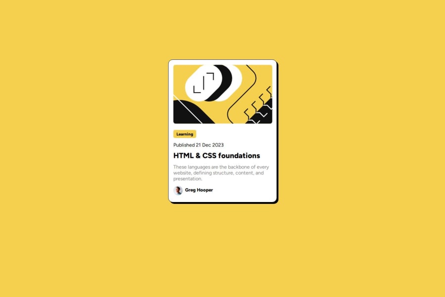
Mobile responsive blog post created using HTML and CSS
Design comparison
Solution retrospective
The mobile responsiveness. I've encountered it on my first challenge creating the QR code and it isn't mobile responsive. So, I studied it, and in this challenge the blog post I used it. It's now mobile responsive.
What specific areas of your project would you like help with?Hey guys feel free to check my code. and please be honest about the things that I can improve better. Thanks for checking and helping me to be a better developer.
Community feedback
- @CreativeLogicPosted 7 months ago
Hi. Good job. You can add more padding on top for the desktop version to bring it down a bit more, like the design. Also for mobile, what I did was bring the card all the way to the top with Flexbox and use less padding to bring it down again. On mobile, the design calls for the card to be a bit higher up than desktop, so the user doesn't have to scroll as much to see the content.
Marked as helpful0
Please log in to post a comment
Log in with GitHubJoin our Discord community
Join thousands of Frontend Mentor community members taking the challenges, sharing resources, helping each other, and chatting about all things front-end!
Join our Discord
