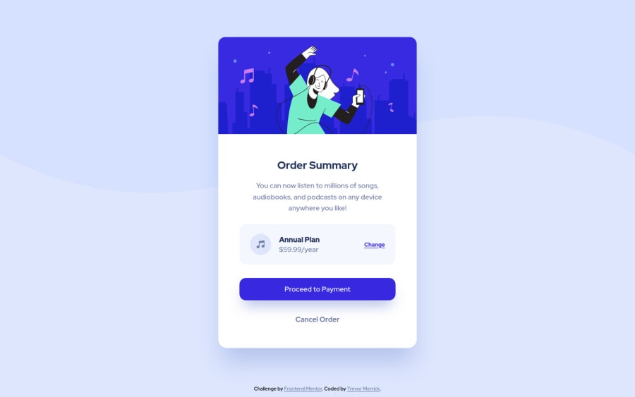
Mobile ready first page using BEM and accessibility in consideration
Design comparison
Solution retrospective
Great first try at this. I'm loving it a lot.
Community feedback
- @tmerrick17Posted about 3 years ago
Thanks for the comments. I really appreciate the feedback.
Things I fixed:
- I took out the alt attribute after reading this article to better understand what you were saying. https://supercooldesign.co.uk/blog/how-to-write-good-alt-text I appreciate this. I will do this going forward with more “decorative” images.
Things to (kindly) push back on:
- In the syle-guide.md file it specifies the desktop width to be 1440px on line 8. This is simply where I added the pattern-background-desktop.svg to the background. You are right though, I would have added the desktop background probably closer to 1200px but I want to be a precise as possible with the documentation. Thoughts on this?
Questions on:
- In the very beginning of you comments you mention “…background-wave is not really taking the whole width like it’s supposed to.”
Both mobile and desktop wave backgrounds go across my browser all the way. I’ve tested out on: Operating System macOS High Sierra Version 10.13.6 - Firefox 92.0 (works like the solution displays) - Chrome 93.0.4577.82 (works like the solution displays) - Safari 13.1.2 (wave background doesn’t show up at all…will check into this.)
What browser is this happening to on your end?
Most importantly I really do appreciate all the feedback. I’ve been coding for just about a year now and Frontend Mentor has already been a great find!
0 - @pikapikamartPosted about 3 years ago
Hey, great work on this one. Layout looks fine, just the background-wave is not really taking the whole width like its supposed to. I am using 1366x768 screen.
Some suggestions would be:
- The music icon should have used
alt=""since it is just a decorative image. Also, when usingaltattribute, avoid adding words that relates to "graphic" like "symbol, image, icon", assistive tech will handle those for you. - The
min-width: 1440pxon yourmediaquery is too big for the whole mobile layout to occupy. If you do this, users like me with 1366x768 won't see the desktop layout, we need to zoom out just to see it, adjusting it to a lower would be really great.
Aside from those, the markup looks really good and this is really great and I think this is great site.
0@tmerrick17Posted about 3 years ago@pikamart Again thanks again for the feedback. I went back and did a massive update to this. If you noticed the size of the overall card was smaller then the example. I finally downloaded an app called PixelSnap (cost $27 with student discount) and was so worth it. I can actually measure out things on the design files. I even backtrack my push back on the min-width: 1440px. It just looks better in my eyes at around 600px. Well before even 1366px. You were right. Thanks again!
0@pikapikamartPosted about 3 years ago@tmerrick17 Hey, awesome work once again. I read your previous comment just right now, didn't get a notif since it is not a reply.
On the style guide, the 1440px is just the design, so it doesn't mean that you should use 1440px as a media query right, just to apply the desktop layout.
If you think about it, if you create the desktop layout for example, 1000px going upwards, then you will still have those in 1440px right? Because like I said, users like me using 1366x768 needs to zoom out because the media query applies only to 1440px which you don't want right, that is why the background-wave-image on my end is not the desktop version, rather the mobile version of the wave, since the wave is applied to the 1440px.
Also, woah you don't really need to buy that just to make the design as close, eyeballing for design can be satisfying if it really close of what you did, but what is important first is how good the experience for all users rather than how good the design is. Also I use chrome primarily ^
Marked as helpful0 - The music icon should have used
Please log in to post a comment
Log in with GitHubJoin our Discord community
Join thousands of Frontend Mentor community members taking the challenges, sharing resources, helping each other, and chatting about all things front-end!
Join our Discord
