Design comparison
Solution retrospective
Guys this is my first project in frontend mentor; please give me feedback and comment
Community feedback
- @cjdemillePosted over 2 years ago
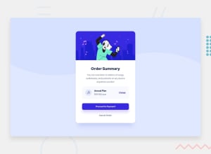
This is pretty good for your first project! The biggest thing off the bat is the aspect ratio and spacing. The card looks like it could use more white space on the whole and the box with the plan information can definitely use some padding to make it more readable.
On mobile, the white card containing the content gets smaller and the "proceed to payment" takes up the entire width of the screen. Adding some padding to the card might help with that.
Also, the "proceed to payment" button might be more user-friendly if it was a bit taller. I usually try to shoot for buttons on mobile to be about thumb-sized.
On the card, you could use an h2 header instead of an h4 and use CSS to style it apporpriately. It will stick to the standard heading hierarchy by only incrementing by one.
One thing on code readability, it looks like you used "dev" instead of "div" in your HTML. It's obviously working and displaying properly, but it did make me do a double take.
Marked as helpful0
Please log in to post a comment
Log in with GitHubJoin our Discord community
Join thousands of Frontend Mentor community members taking the challenges, sharing resources, helping each other, and chatting about all things front-end!
Join our Discord
