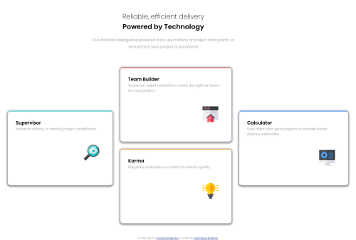
Mobile first workflow with flex components for desktop layout.
Design comparison
Solution retrospective
Hello everyone , Really loved the creativity of this project any feedback on this is much welcomed .
Community feedback
- @zeerobitPosted almost 3 years ago
- noticed you use <br> in your header to break the content, i would advise not to style your layout in html, leave it to css. Remove the span tags from "Reliable, efficient delivery" and wrap "Powered by Technology" in h2 tags
- this margin-left: 24%; you have on the header i'm guessing it's for centering it but this is not the correct way. Use margin: auto; instead
- use rem instead of px since px is not scalable
- remove height: 300px; from .card let the content dictates the height
Hope this helps, Happy coding :)
Marked as helpful1@vanzasetiaPosted almost 3 years ago@zeerobit @Pablo-cyber21 I think the better solution for the
Reliable, efficient delivery...
would be something like this:<h1> <span>Reliable, efficient delivery</span> <span>Powered by Technology</span> </h1>
By doing that, the screen reader will read the text as one sentence ("Reliable, efficient delivery, powered by technology"). In my opinion, it makes sense to make those words as one sentence rather than separate them.
The
span
tag is used for styling (e.g. break the text into two lines).Marked as helpful2@zeerobitPosted almost 3 years ago@vanzasetia i agree.. Powered by Technology should be wrapped in span
0
Please log in to post a comment
Log in with GitHubJoin our Discord community
Join thousands of Frontend Mentor community members taking the challenges, sharing resources, helping each other, and chatting about all things front-end!
Join our Discord