Mobile First Workflow - Notification Page
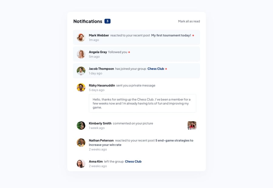
Design comparison
Solution retrospective
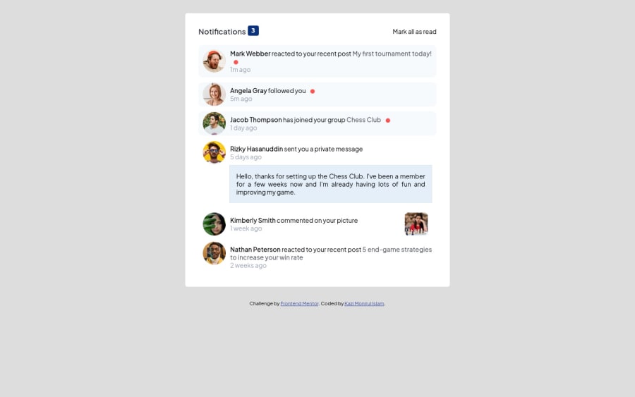
I am learning coding for 06 months. I found CSS a little bit of time talking. I have used vanilla javascript. In but future I will use react.js. Otherwise, the project is quite easy.
I think I am using too much CSS. Can it be minimized?
I have seen many tutorials and videos. I am unsure about the best practice of coding.
Please help me with feedback on my project (01 to 10) with details, so that I can understand how much I learned.
Thanks everyone.
Community feedback
- @riickyallvesPosted about 2 years ago
Regarding the HTML, I have seen one crucial mistake: Never use the same ID for more than one element. IDs should always be unique and they are used to identify one element. Having one ID for different elements is the same as 5 people using the same passport number, which is impossible 😅.
Furthermore, the code for the notifications count could be modified:
Old code
<div class="notify-icon">
    <p>Notifications <span><button>3</button></span></p>
</div>
New code
<div class="notify-icon">
    <p>Notifications <span><div id="notifications-count">3</div></span></p>
</div>
I see you have not coded to show zero when the Mark all as read button is pressed. You could add this to the Mark all as read code in Javascript:
const notificationsCount = document.getElementById("notifications-count")
notificationsCount.textContent = 0
This should make the counter reset to zero.
Marked as helpful1@johnny064Posted about 2 years ago@riickyallves Thanks a lot man. I have corrected my code according to you. So now I have not used any ID. Also, I have grouped the same class in CSS. Please check my code now.
0 - @AdrianoEscarabotePosted about 2 years ago
Hi Kazi Monirul Islam, how are you?
I really liked the result of your project, but I have some tips that I think you will like:
1- Every page should have one main landmark
<main>. So replace the div that wraps the whole content with<main>to improve the accessibility. click here2- We have to make sure that all the content is contained in a reference region, designated with HTML5 reference elements or ARIA reference regions.
Example:
native HTML5 reference elements:
<body>
    <header>This is the header</header>
    <nav>This is the nav</nav>
    <main>This is the main</main>
    <footer>This is the footer</footer>
</body>
ARIA best practices call for using native HTML5 reference elements instead of ARIA functions whenever possible, but the markup in the following example works:
<body>
     <div role="banner">This is the header</div>
     <div role="navigation">This is the nav</div>
     <div role="main">This is the main</div>
     <div role="contentinfo">This is the footer</div>
</body>
It is a best practice to contain all content, except skip links, in distinct regions such as header, navigation, main, and footer.
Link to read more about: click here
2- Why it Matters
Navigating the web page is far simpler for screen reader users if all of the content splits between one or more high-level sections. Content outside of these sections is difficult to find, and its purpose may be unclear.
HTML has historically lacked some key semantic markers, such as the ability to designate sections of the page as the header, navigation, main content, and footer. Using both HTML5 elements and ARIA landmarks in the same element is considered a best practice, but the future will favor HTML regions as browser support increases.
Rule Description
It is a best practice to ensure that there is only one main landmark to navigate to the primary content of the page and that if the page contains iframe elements, each should either contain no landmarks, or just a single landmark.
Link to read more about: click here
Prefer to use
removerpxto have your page working better across browsers and resizing the elements properlyThe rest is great!!
Hope it helps...👍
Marked as helpful1@johnny064Posted about 2 years ago@AdrianoEscarabote Thanks a lot man for your feedback. I have now corrected my code according to your thoughts. Please check my code now.
0 - @riickyallvesPosted about 2 years ago
Hello Kazi. I hope you are doing great.
Seen the files in the repository and I have some tips for you:
Regarding your CSS code, I would advise to break down the project in your head or on paper before actually diving into the project itself. By doing this, the objective is to see which <div> or other elements have the same children inside.
For example, in your case, you have a notification which always contains an <img> and 2 <p>, meaning that the styling of one notification will be the same for the other ones.
Let's see how can we refactor your code. There are two ways to do this:
Your old code:
.not01{
    margin-bottom: 10px;
    background-color: hsl(210, 60%, 98%);
    border-radius: 10px;
    padding: 10px;
}

.not02{
    margin-top: 10px;
    background-color: hsl(210, 60%, 98%);
    border-radius: 10px;
    padding: 10px;
}

.not03{
    margin-bottom: 10px;
    background-color: hsl(210, 60%, 98%);
    border-radius: 10px;
    padding: 10px;
}
Method 1 The first way would to group all of the different classes:
.not01, .not02, .not03, .not04 {
    margin-bottom: 10px;
    background-color: hsl(210, 60%, 98%);
    border-radius: 10px;
    padding: 10px;
}
Why is this method not efficient? Imagine you had a real application where there would be THOUSANDS of notifications. You would have to manually add each one (.not01, ... , .not847, .not848, etc)
Another thing is that your application would not be so dynamic, because the classes would be hard-coded into every element, one by one. Which would lead you to show a limited number of notifications to the user (no one would want to write up to .not500 😆).
The second way would be to create one class for all the
<div>elements, which would be the correct method:Method 2
.notification {
    margin-bottom: 10px;
    background-color: hsl(210, 60%, 98%);
    border-radius: 10px;
    padding: 10px;
}
This way every child's style would follow as:
.notification img{
    float: left;
    margin-top: -8px;
    margin-right: 10px;
}

.notification p a:first-child{
    color: black;
    text-decoration: none;
    font-weight: 800;
    cursor: pointer;
}

.notification p a:last-child{
    color: hsla(224, 21%, 14%, 0.714);
    text-decoration: none;
    font-weight: 800;
    cursor: pointer;
}
And the best part? You would only write once for every notification :)
If you have any questions, I will do my best to answer them.
Happy coding!
1
Please log in to post a comment
Log in with GitHubJoin our Discord community
Join thousands of Frontend Mentor community members taking the challenges, sharing resources, helping each other, and chatting about all things front-end!
Join our Discord
