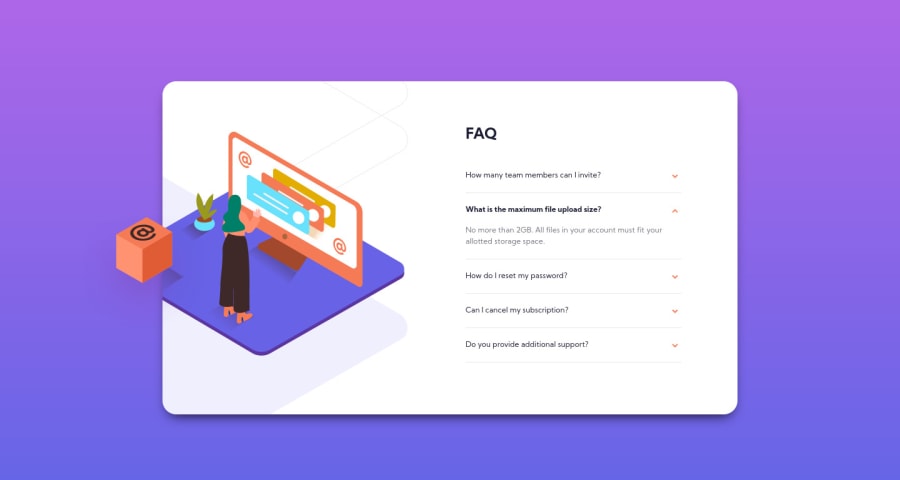
Mobile first Workflow, CSS Grid, Without JS
Design comparison
Solution retrospective
need feedback for accordion functionality. I created the accordion using radio button if there any better best practice will be very appreciate. Thank you
Community feedback
- @grace-snowPosted over 3 years ago
Hi
You need to hide your inputs in a different way I think. Using the hidden attribute hides the inputs from assistive technology, making this unusable for people using screenreaders or keyboards. Look up how to visually hide content but keep it accessible (eg opacity).
Make sure each question also has a visible focus state.
That all said, I really like this approach for a js-free solution. And it works better than details-summary if you only want one faq to be open at a time. We'll done 👍
The only small design issue I notice on mobile is the questions need a bit of padding right. On my phone some questions are overlapping the chevron icon.
I hope the advice helps
0@madegilangadityaPosted over 3 years ago@grace-snow Thanks for the advice, I will work on it
0 - @palgrammingPosted over 3 years ago
well as someone commented on my solution the <detail> <summary> tags might help but I have not tried them yet http://html5doctor.com/the-details-and-summary-elements/
0@madegilangadityaPosted over 3 years ago@palgramming Thanks for suggestions will look into it
0
Please log in to post a comment
Log in with GitHubJoin our Discord community
Join thousands of Frontend Mentor community members taking the challenges, sharing resources, helping each other, and chatting about all things front-end!
Join our Discord
