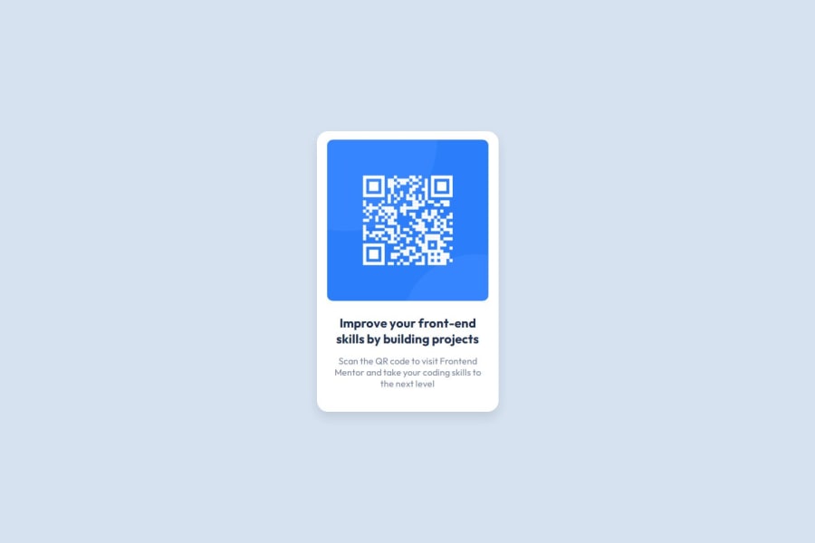
Mobile-first workflow, CSS Box Model for spacing and borders,
Design comparison
Solution retrospective
I am really proud that this is my first project that I completed on my own without waiting for guidance from an instructor. I overcame my fear of needing to review HTML and CSS courses before starting the challenge. Instead, I dove straight in without much review and am happy that, by the grace of God, I was able to search for solutions to any problems I encountered and successfully finish this small but exciting project.
There are two additional things I am particularly proud of:
Centering the page vertically using Flexbox: This was something I hadn't learned before, and I’m pleased that I managed to figure it out. Using a font family that is not installed on my device: It was the first time I accomplished this, and I’m happy with how it turned out.
What challenges did you encounter, and how did you overcome them?The challenge I faced:
- Adding a favicon, and here's how I overcame it:
- using font family which is not installed on my device. Here's how you can use a font family form google fonts.
body {
  font-family: "Outfit", sans-serif;
  font-optical-sizing: auto;
  font-style: normal;
}
- centering the page vertically, here's how I overcame it:
What specific areas of your project would you like help with?body { display: flex; align-items: center; height: 100vh; }
in the html file:
- I used five meta elements, is that a good practice?
- what about the structure of the semantic html5 elements like div and article and ...
in the css file:
- what's your opinion in the naming of the classes, is that a good practice?
overall feedback:
- when I finished the project and see the design on the mobile phone, I found that the edge of the container is nearly took the width of the screen and there is not any spaces like the required design, so I tried to modify the width of the container and the image so that it could fit, the question is how to handle the mobile design in the first time when I am writing the code and see the effect on the desktop?
- any advices on how to make a pixel perfect application especially when it is concerned with something on the design that is not mentioned in the style-guide?
Community feedback
Please log in to post a comment
Log in with GitHubJoin our Discord community
Join thousands of Frontend Mentor community members taking the challenges, sharing resources, helping each other, and chatting about all things front-end!
Join our Discord
