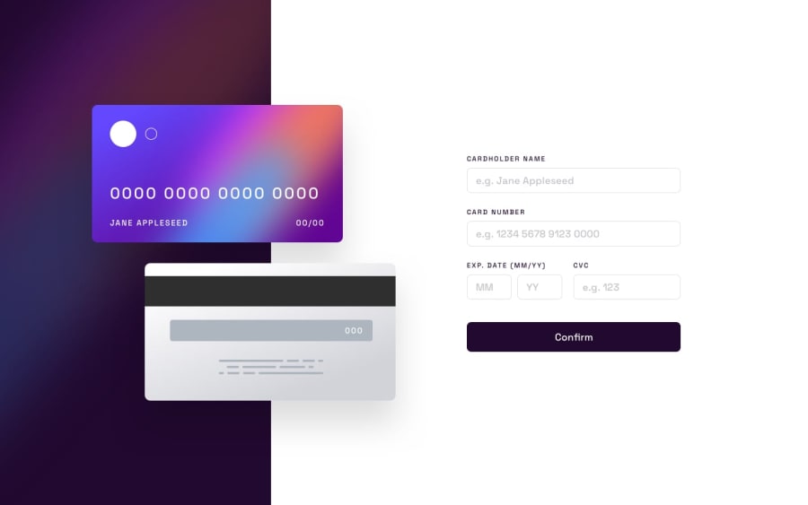
Design comparison
SolutionDesign
Community feedback
- @imohib168Posted about 2 years ago
You've done a great job Juan. In my opinion, there are a few points that you should consider:
- Adding Validation in the form.
- Responsiveness issues on iPad or other tablet size devices.
- Cards are too far away from each other on tablet devices.
- Input fields are not fully aligned on responsive/mobile devices.
0
Please log in to post a comment
Log in with GitHubJoin our Discord community
Join thousands of Frontend Mentor community members taking the challenges, sharing resources, helping each other, and chatting about all things front-end!
Join our Discord
