Design comparison
SolutionDesign
Solution retrospective
Any feedback will be appreciated :)
Community feedback
- @palgrammingPosted over 3 years ago
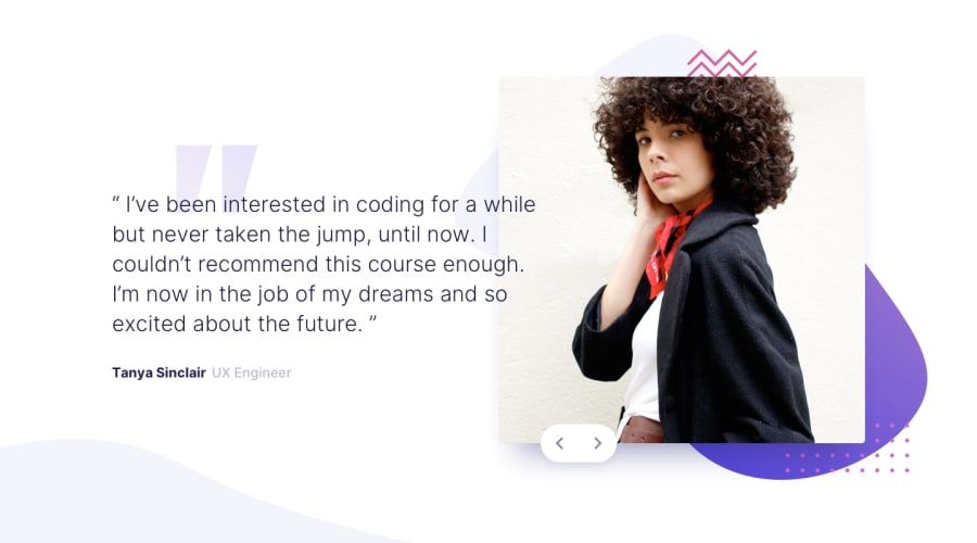
looks like you have a good start to the project but you have button navigation issues that you need to address. The position of the button elements are wrong and the arrows while showing on the screen are not showing in their curved container
0@voxx1Posted over 3 years ago@palgramming Oh I updated my code, but forgot to put it on github in new version, everything should be working now! Thanks!
0@palgrammingPosted over 3 years ago@voxx1 looks better but in desktop view the left right arrows are two different sizes in the mobile view they are the same
0
Please log in to post a comment
Log in with GitHubJoin our Discord community
Join thousands of Frontend Mentor community members taking the challenges, sharing resources, helping each other, and chatting about all things front-end!
Join our Discord
