Design comparison
SolutionDesign
Solution retrospective
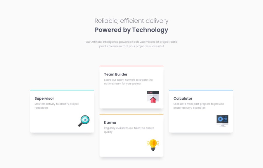
- Was CSS grid the right choice here, or do you think flexbox could have served the design better? 1.2) Could I have made the cards flow into their places more easily, ie without having to manually input their grid positions?
- Is it possible to animate the movement of cards between media queries? I couldn't find a transition property that seemed to work.
Community feedback
- @eljasiuPosted over 4 years ago
Hello, I think that both Grid and Flexbox is a good option in this project. Just depends on your personal preference:-)
0
Please log in to post a comment
Log in with GitHubJoin our Discord community
Join thousands of Frontend Mentor community members taking the challenges, sharing resources, helping each other, and chatting about all things front-end!
Join our Discord

