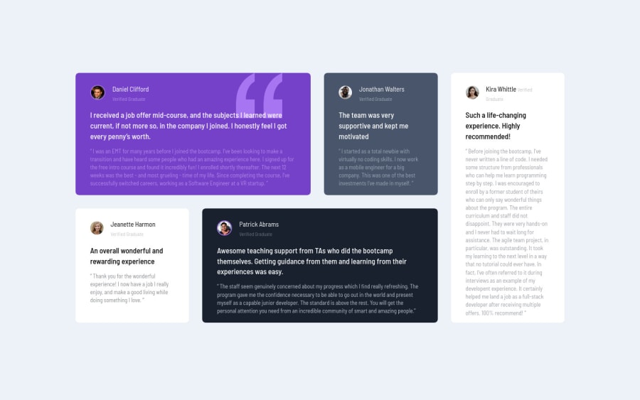
Design comparison
Community feedback
- @correlucasPosted about 2 years ago
👾Hello Sergiu, Congratulations on completing this challenge!
Great code and great solution! I did this challenge too and know how hard it is to set up this
grid layout. I think you've done a really good job building everything! Here's some tips for you:The content is not fully aligned yet.Make the vertical alignment using
flexproperties andmin-height. First of all putmin-height: 100vhto thebodyto make the body display 100% of the viewport height (this makes the container align to the height size thats now 100% of the screen height) size anddisplay: flexeflex-direction: columnto align the child element (the container) vertically using the body as reference.body { min-height: 100vh; margin: 0; font-size: 13px; background-color: hsl(210, 46%, 95%); font-family: 'Barlow Semi Condensed'; display: flex; align-items: center; justify-content: center; }Improve your html markup using meaningful tags and replace the important blocks of content with better tags, for example the main div that takes all the content can be wrapped with
<main>or section, the cards you can be replaced the<div>that wraps each card with<article>you can wrap the paragraph with the quote with the tag<blockquote>this way you'll wrap each block of element with the best tag in this situation. Don’t usedivfor the important blocks, ever prefer some tag that shows what its containing the block.Here's a complete guide for HTML semantic TAGS: https://www.w3schools.com/TAgs/default.asp
✌️ I hope this helps you and happy coding!
Marked as helpful0@SergiuStancioiuPosted about 2 years ago@correlucas Thanks for your tips, I really appreciate taking your time to look on my code.
0
Please log in to post a comment
Log in with GitHubJoin our Discord community
Join thousands of Frontend Mentor community members taking the challenges, sharing resources, helping each other, and chatting about all things front-end!
Join our Discord
