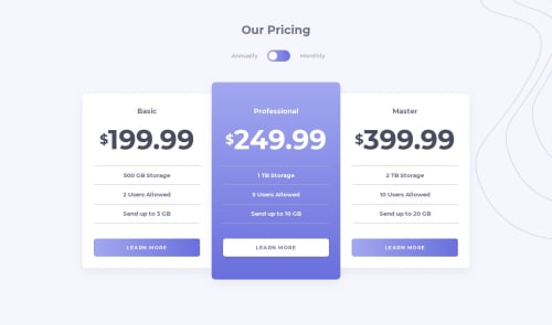
Submitted about 5 years agoA solution to the Pricing component with toggle challenge
Mobile first with attempt at accessible toggle switch
@dinakonto

Solution retrospective
My biggest focus for this challenge was making the pricing toggle accessible, particularly for screenreader users. I read a lot of articles but they were mostly focussed on on/off toggle buttons and used checkboxes or buttons as their base HTML element.
Semantically, this toggle felt more like it made more sense as a radio group so I tried to start with those. I definitely don't think I've succeeded - please let me know what you think and link to any other options you've seen!
Code
Loading...
Please log in to post a comment
Log in with GitHubCommunity feedback
No feedback yet. Be the first to give feedback on Dina's solution.
Join our Discord community
Join thousands of Frontend Mentor community members taking the challenges, sharing resources, helping each other, and chatting about all things front-end!
Join our Discord