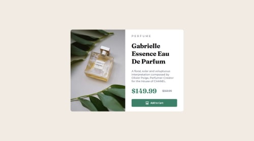
Submitted over 1 year agoA solution to the Product preview card component challenge
Mobile first website approach

@Rabelahmed
Solution retrospective
What are you most proud of, and what would you do differently next time?
Made it in a one sitting , used mobile first approach and used picture element to which allows you to display different images for different screen sizes
Code
Loading...
Please log in to post a comment
Log in with GitHubCommunity feedback
No feedback yet. Be the first to give feedback on Rabel's solution.
Join our Discord community
Join thousands of Frontend Mentor community members taking the challenges, sharing resources, helping each other, and chatting about all things front-end!
Join our Discord