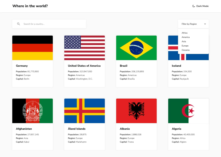
Design comparison
Solution retrospective
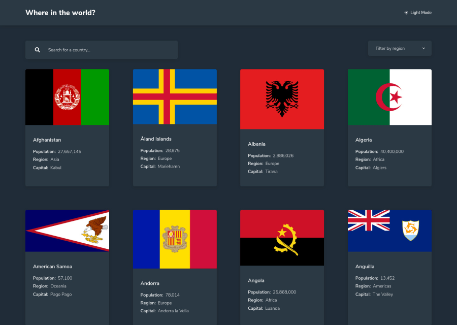
For the searchbar I added a dropdown list with suggestions on every 'keyup' for what country the user is looking for. It was not mentioned in the styleguide, but i thought it would be a nice challenge too. I struggled a bit with the different sizes of the flag images, because I didn't want them to be cut off. How did you solve this?
Do you have suggestions for improvement?
Community feedback
- @ianbrdeguzmanPosted about 4 years ago
Hello Oliver!
I had the same problem with the flags. Then I found out about CSS property object-fit. More info here. https://developer.mozilla.org/en-US/docs/Web/CSS/object-fit
0@oliversteidelPosted about 4 years ago@ianbrdeguzman Hey Ian, thanks for your comment. I tryed it this way already and I neither like that the flags are cut off on 'object-fit:cover', nor the egdes you see on 'object-fit:contain'. I think I have to decide which is the lesser evil.. I appreciate your help!
0
Please log in to post a comment
Log in with GitHubJoin our Discord community
Join thousands of Frontend Mentor community members taking the challenges, sharing resources, helping each other, and chatting about all things front-end!
Join our Discord
