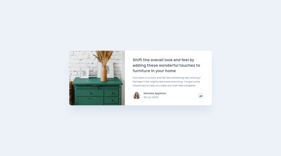
Design comparison
Solution retrospective
I wanted to create the tooltip with vanilla Javascript. It was a bit tricky because in the mobile design, the share button is embed in the tooltip. So I gave myself the freedom not to change the appearance of the share button when the tooltip active in the mobile version. How would you have done it ?
Community feedback
- @skyv26Posted almost 3 years ago
Hi! Eric, Really nice work. I tested your design responsiveness and it is good. I checked your report and I saw there is two error in your HTML
You can see this
<img src="images/avatar-michelle.jpg" alt="" class="c-article__avatar" width="40px" height="40px">
you have used px along with size in width and height attribute.
Keep in mind in html if you are using attribute like width and height then you just need to pass value without any unit. Like below:
<img src="images/avatar-michelle.jpg" alt="" class="c-article__avatar" width="40" height="40">
So by updating your code with above one, it will solve html issue.
- You can see one thing in above snippet that you didn't add alt text and that's why you get accessibility issue. So add alt text like below:
<img src="images/avatar-michelle.jpg" alt="owner's photograph" class="c-article__avatar" width="40" height="40">
- Wrap yout c-article div inside the main tag like below:
<main> <div class="c-article"> ....... ......... .............. ...... </div> </main>
It will solve your landmark accessibility issue.
I hope you understand . Overall you did good work. My above suggestions might be helpful for you.
Good Luck
Marked as helpful1
Please log in to post a comment
Log in with GitHubJoin our Discord community
Join thousands of Frontend Mentor community members taking the challenges, sharing resources, helping each other, and chatting about all things front-end!
Join our Discord