Design comparison
SolutionDesign
Solution retrospective
Feedback appreciated :)
Community feedback
- @VincenzoMarcovecchioPosted over 4 years ago
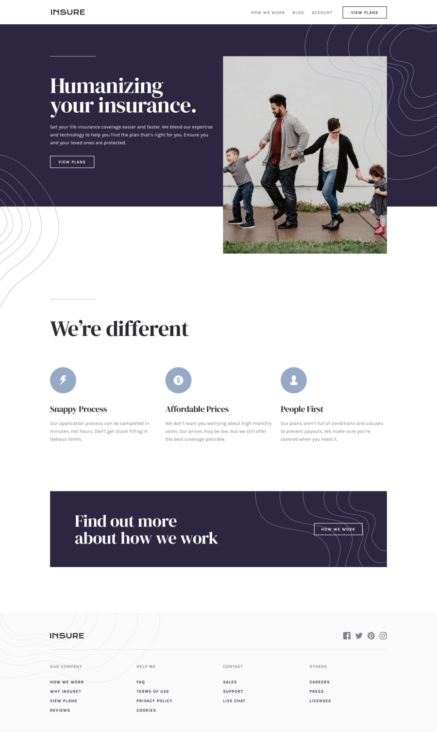
You're not far from design, maybe just a better understanding of sizes and dimensions, that footer got you a little bit higher (we have to make the designer happy) this slider comparison up here helps to see our mistakes. It just takes time though, so keep practicing! Great job 👍
1 - Account deleted
I like the structure of the page, well positioned and clean.
1
Please log in to post a comment
Log in with GitHubJoin our Discord community
Join thousands of Frontend Mentor community members taking the challenges, sharing resources, helping each other, and chatting about all things front-end!
Join our Discord
