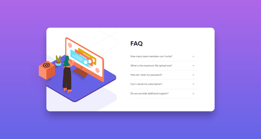
Design comparison
Solution retrospective
Feedback appreciated
Community feedback
- @Seti108Posted almost 4 years ago
Really nice and clean JS code! Seems to be working well. Did you plan out from the beginning to have the toggle-functionality (when one qa-pair is active, the others are "collapsed")?
0@juryousPosted almost 4 years agoThank you! Yes, it made more sense for me to toggle between them rather than have them stay open.
0 - @sadumbPosted almost 4 years ago
Hello juryous, I think your solution looks clean and nice. How did you set the .content width and height? I usually use flexbox or set them manually, and i don't understand how could you set them. Could you tell me how to do it? Thanks.
0@juryousPosted almost 4 years agoHello sadumb, Thank you! Generally it's not a good idea to set fixed width/height. I only set max-width on the .content so it doesnt grow too much on big screen sizes, and it's height is determined by the content inside.
1@sadumbPosted almost 4 years ago@juryous Oh God why do i forgot about this hahaha. Thank you for your answer juryous, let me steal this method ok? . I fixed my solution by following your code and now my solution is mobile responsive. Could you give me some feedback on my solution? Thanks. . Link : https://www.frontendmentor.io/solutions/faqaccordion-using-sass-ux4h_bZyl
0
Please log in to post a comment
Log in with GitHubJoin our Discord community
Join thousands of Frontend Mentor community members taking the challenges, sharing resources, helping each other, and chatting about all things front-end!
Join our Discord
