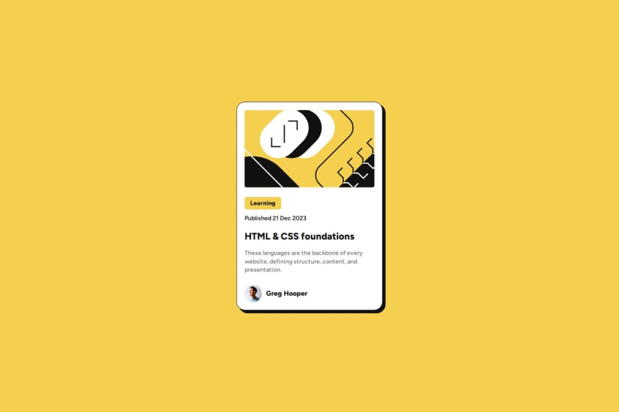
Design comparison
Solution retrospective
All feedback appreciated.
Community feedback
- @danielmrz-devPosted 10 months ago
Hello again @Norwyx!
Your solution looks excellent!
I'd just try to match the image's
border-radiuswith the container's.Other than that, my friend, you did an awesome job!
Marked as helpful1 - @Ezekiel225Posted 10 months ago
Hello there 👋 @Norwyx.
Good job on completing the challenge !
Your project looks really good!
I have a suggestion about your code that might interest you.
There is an very useful browser extension called Perfect Pixel that allow you compare with the design image and thus see the exact dimensions. I recommend it to you.
I hope this suggestion is useful for future projects.
Other than that, great job!
Happy coding.
Marked as helpful1@NorwyxPosted 10 months ago@Ezekiel225 Hey there Olaniyi. Thanks for the recommendation! @danielmrz-dev told me about the extension but I really couldn't get the image to cover the whole window so I just gave up and have been using the Mac image preview tool and it works ok. If you can maybe link how to actually use the tool I'd appreciate.
0
Please log in to post a comment
Log in with GitHubJoin our Discord community
Join thousands of Frontend Mentor community members taking the challenges, sharing resources, helping each other, and chatting about all things front-end!
Join our Discord
