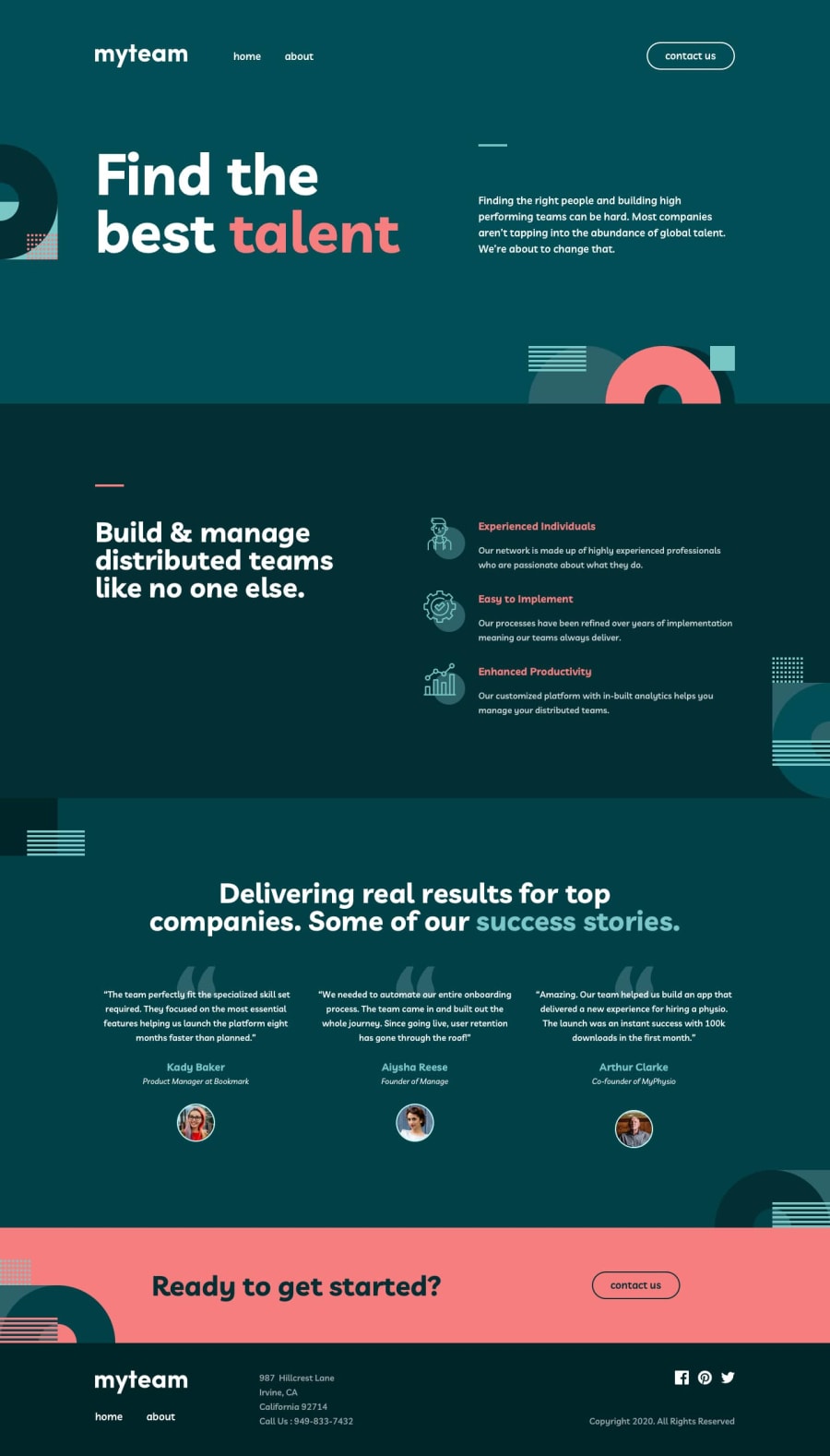
Design comparison
SolutionDesign
Solution retrospective
Feel free for any advice !
Community feedback
- @vanzasetiaPosted about 2 years ago
Hi, Suleyman! 👋
Nice custom favicon! 👏 I never thought about making one of the background's SVG as a favicon. I ended up designing a custom favicon for my solution.
Also, good job labeling the
navelements! 👍Some suggestions from me.
- Internal navigation should not have
target="_blank". It is not a good user experience because a user, I can't choose to not open a new tab. - Also, any links that will open a new tab must have an indicator to tell users that it will open a new tab. Otherwise, it can cause problems for some users. I recommend only making links open a new tab when it is necessary.
- For images that are used only as decorations (they do not give users any information and serve only an aesthetic purpose), the alt tag should still exist but should be left empty:
alt="". This will tell the screen reader to simply skip over the image. - I recommend taking a look at "Quick tip: Using alt text properly - The A11Y Project".
- Link must have an accessible name. I recommend using
aria-labelto label each social media link.
I have three recommended videos. The first one tells how hard HTML is (HTML is not easy). The other two talk about modern CSS techniques and approaches.
- Manuel Matuzović - Lost in Translation - YouTube
- Andy Bell – Be the browser’s mentor, not its micromanager - YouTube
- Stephanie Eeckles - Scaling CSS Layout Beyond Pixels - YouTube
I hope this helps! Happy coding!
Marked as helpful1 - Internal navigation should not have
Please log in to post a comment
Log in with GitHubJoin our Discord community
Join thousands of Frontend Mentor community members taking the challenges, sharing resources, helping each other, and chatting about all things front-end!
Join our Discord
