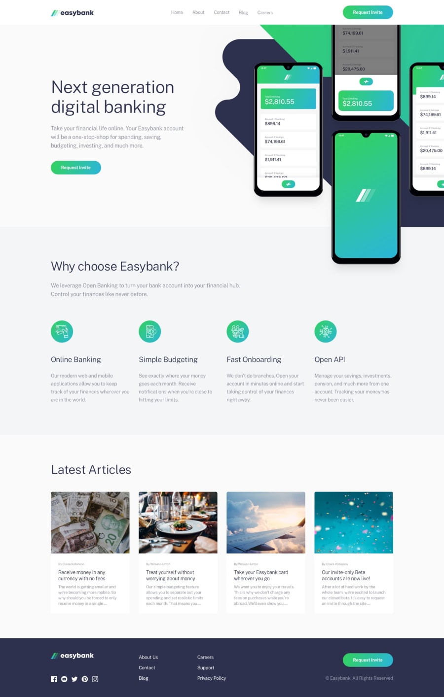
Design comparison
Solution retrospective
Really happy with the result, any feedback is highly appreciated :) Also i already know there is a bug I don't know how to fix and that is opening the menu in the mobile preview and then the menu doesn't dissapear when scaling the viewport to the desktop size. Any suggestions on how to tackle this problem would be very nice.
Community feedback
- @pikapikamartPosted about 3 years ago
Hey, great work on this one. The layout both desktop and mobile is really good, the responsiveness as well is great.
Some suggestions would be:
- The website logo on the
headertag, theatag that wraps it needs aaria-label="Homepage"since usually, company logo leads to the homepage link. - The
altvalue for theheaderlogo should only bealt="easybank". Avoid including words like "icon, image, logo" or any word that relates to "graphic" as a value inalttext. Assistive tech will handle those for you. - On the
headerpersonally, I would separate the company logo link from thenav. I would wrap the other 5 links inside thenavso that it will be more distinct to a user, especially in mobile state where the dropdown only contains the 5 links and not the company logo, that would create a confusion. - Nesting as well the 5 links inside
ulelement since it is a list of links, also this would guide a user on how many links there are , since screen readers will say how many items are there inside a list element. - Have a
mainelement that will wrap the whole section, starting from the hero-section, going down to the articles section. This would create more structuring in your html. - On the article section, the 4 cards could be wrapped as well inside an
articletag since it is an article right, that would make sense for other user. It would be:
<a> <article> { contents inside here} </article> </a>- The
sectionelement for thefooteryou might want to replace that with actualfooterelement. - The website logo in the
footer, inside thesvgyou need to have atitleelement. This acts as a text for screen reader user, since thesvgdoesn't have any text inside it, a screen reader can't tell what it is. By giving atitleit would know what it should say to the user. Adding like:
<title>easybank </title>-
Social media links as well could be wrapped inside
ulsince those are list of links. -
Each
atag that wraps the social media should havearia-labelon them, likearia-label="facebook"to theatag that wraps the facebook icon. Also, it would be great to addaria-hidden="true"on thesvgfor the social media links. -
The other 6 links as well could be wrapped by the
ulelement. -
On mobile state, the hamburger menu toggler should have used
buttonelement instead ofatag since it is not really a link right, it is just a control, that is whybuttonshould be used. It should also havearia-label="hamburger dropdown toggler"so that user will know what this control is. -
Add as well
aria-expandedattribute on the hamburger toggler, this way, you will inform a screen reader user that it expanded something, hence it is the dropdown.
Overall, this is great especially the layout. Great job.
Marked as helpful0@trostjanPosted about 3 years ago@pikamart wow, thanks for the comprehensive and well constructed feedback! It's so easy to forget that there is already the common markup built in html such as article and footer when you are used to just creating div for everything... I will need to be more carefull in my future projects!
0 - The website logo on the
- @ConradMcGrifterPosted about 3 years ago
looks really nice, good job!
as far as the mobile nav remaining opened when scaling up to desktop size, I think you could just write a media query to hide it
Marked as helpful0
Please log in to post a comment
Log in with GitHubJoin our Discord community
Join thousands of Frontend Mentor community members taking the challenges, sharing resources, helping each other, and chatting about all things front-end!
Join our Discord
