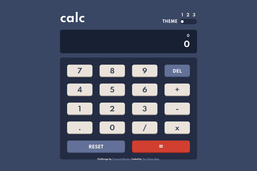
Mobile First using Sass with Typescript
Design comparison
Solution retrospective
Any question/comments is readily welcomed
Community feedback
- @BeygsPosted almost 4 years ago
Nice one, but when enter a number with a lot of digits it overflows to the left of the calculator screen.
1@Yellow-MayPosted almost 4 years ago@Beygs I overflows? Not expand? While testing I made it so the app itself would expand if it the values are too much. If that's what you meant, the it was intentional so that there won't be a limit on what a user wants to calculate.
0@BeygsPosted almost 4 years ago@Yellow-May Sorry I may have misspoken (English is not my native language), I did a screenshot so you can see what I meant https://imgur.com/a/I1xe4We
1@Yellow-MayPosted almost 4 years ago@Beygs ohh I see Thank you very much for the notice
0 - P@palgrammingPosted almost 4 years ago
Looking good but you first should fix it so you cannot enter multiple 1...........2 between numbers
1
Please log in to post a comment
Log in with GitHubJoin our Discord community
Join thousands of Frontend Mentor community members taking the challenges, sharing resources, helping each other, and chatting about all things front-end!
Join our Discord
