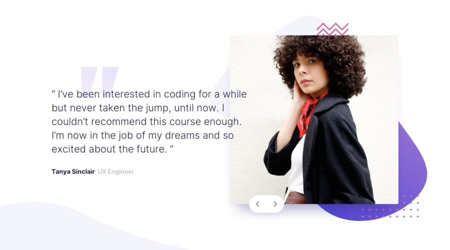
Design comparison
Solution retrospective
Hi there,
The website looks good only at the 375px and 1440px resolution. Please let me know how I can improve my code so it is more responsive and looks alright in every resolution. The biggest struggle for me is to position elements on top of each other - the background does not resize accordingly and the buttons go over the place. The flexbox containers resize ok on mobile version however they do not on the desktop and I do not know from where it comes from.
All feedback really appreciated! Thank you!
Community feedback
- @MarkoNikolajevicPosted over 3 years ago
HI Agnieszka, you did a good job on this challenge
To make your code more responsive you could add more media queries, for example the tablet view is from 768px or 48rem. In your case you changed
flex-directiontorow-reverseat 37.5rem...$bp-desktop: 37.5rem;. I would suggest you to create a few more as$bp-tablet: 48rem. I usually use one media query for laptops and one more for desktops (1440px).In this way you could have more control on different screen sizes.
A part of this, your solution looks good
Keep on coding :)
0@axseingaPosted over 3 years agoHi there @MarkoNikolajevic Thank you for your advise. I thought about this but decided to hold on, as the button moves in every change of resolution (e.g. even from 1440 to 1400). This is because I couldn't add button to the slide itself (that would create two buttons in two slides) so I decided to put it outside of slides but to position it I used position: absolute. The similar issue is with background images, they change every few pixels. I think there should be a change in html or css but spent a lot of time to think about it. The only solution I figure out is to add it to slide and then add slides via js but it is alright for 2 slides but for the future improvement seems like it is a quite pointless to add so big html parts via js.
0@MarkoNikolajevicPosted over 3 years ago@axseinga to avoid button moves you could add
position: relativetoslider-componentdiv, and I would changed button's position fromfixedtoabsolute. The button position would be based on it because it's a child ofslider-componentand then position the button. You could set a width or max-width toslider-componentto have more control0
Please log in to post a comment
Log in with GitHubJoin our Discord community
Join thousands of Frontend Mentor community members taking the challenges, sharing resources, helping each other, and chatting about all things front-end!
Join our Discord
