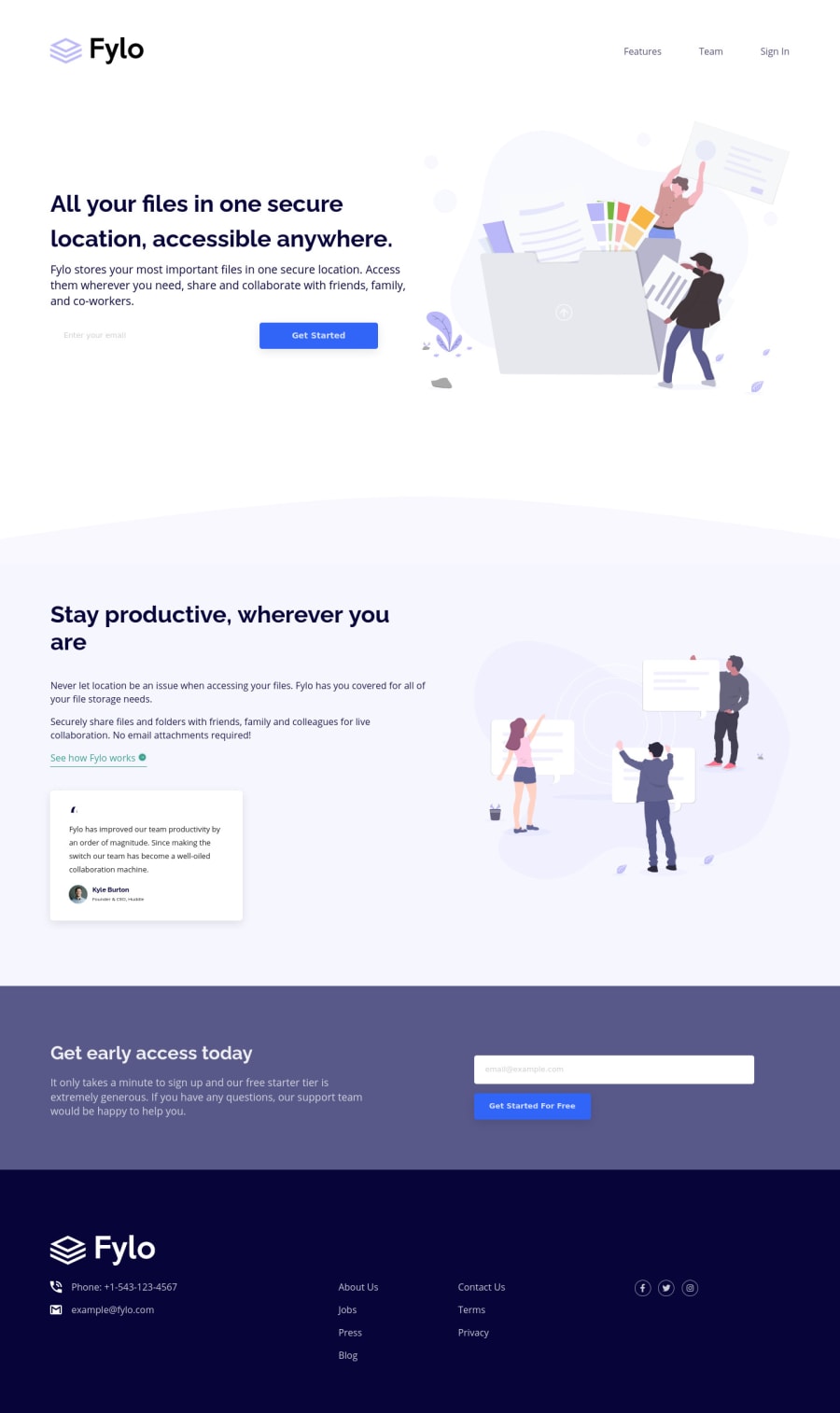
Design comparison
Solution retrospective
I challenged myself to use pure grid for everything on this project. I really learned a lot and certainly, it's easier for some layouts. Many thanks Steve
Community feedback
- @AgataLiberskaPosted over 3 years ago
Hi Stephen, well done! I think it's beautifully responsive, images are resizing well, it looks great!
Make sure you check the automatic reports about your solution, they're really helpful - at the moment it says you're using the same id twice (id's must be unique on the page) and the inputs are missing a label (it's necessary for accessibility, you can just add a label element and hide it visually - making it 1px tall and wide etc.)
I have one suggestion for the design (although I don't know this challenge, so if you just followed the design, sorry!): from mobile size to about 1000px, your design is in a column and the content is centered, except for the footer. I don't think it's a big problem on smaller screens, but when you get closer to tablet-size, you've got quite a lot of unused space on one side and it looks a bit off. What you could try is centering the content in the footer and putting the links into two columns like what it is on desktop (once there's enough space). Again, it's a suggestion, I think it's something you can play around with :)
0@stephentyers1975Posted over 3 years ago@AgataLiberska Hi Agata, Thanks for your feedback. YOu're right there are a few HTML errors that i will fix.
I just followed the two designs provided, but I do agree with your feedback around the larger long mobile layouts that aren't provided with the challenge. I'll need to think about that. Thanks Steve
0
Please log in to post a comment
Log in with GitHubJoin our Discord community
Join thousands of Frontend Mentor community members taking the challenges, sharing resources, helping each other, and chatting about all things front-end!
Join our Discord
