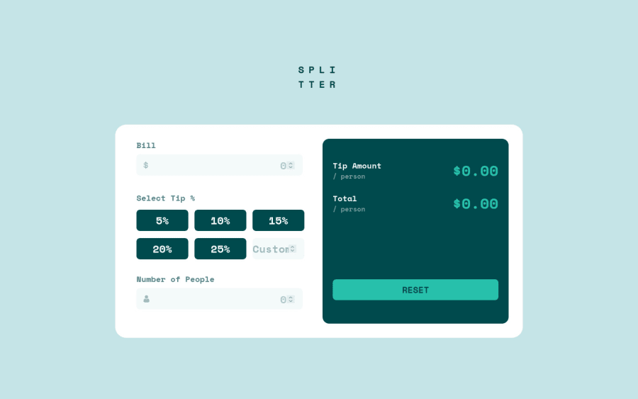


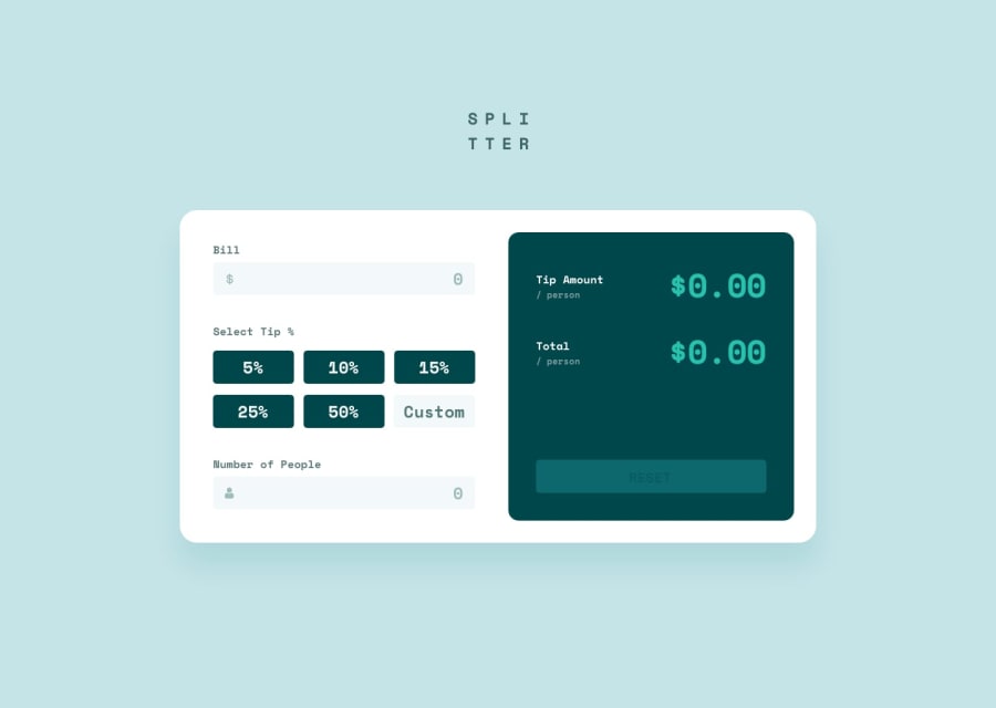
Design comparison
Solution retrospective
I forget to upload this solution, also I fixed some problems with flex on Desktop, so this should be fine! 😁
Community feedback
- @pikapikamartPosted about 3 years ago
Hey, awesome work on this one. Layout in desktop looks great, it is somehow responsive and the mobile state looks fine, just need the input to be centered like what Tee have said.
Some other suggestions would be:
- You shouldn't use:
<h1> SPLI</h1>
<h1> TTER</h1>
This makes it unreadable from assistive tech. What you could have done is that, use only 1
h1to wrap the text like this:<h1> splitter </h1>Then use
text-transform: uppercaseon theh1, do not explicitly type the word capitalized, because instead of being read by the wordsplitter, it will be read out letter by letter. Then to make it wrap, useword-break: break-allon theh1then addmax-widthon it, adjust themax-widthuntil the word breaks.- The
selecttip shouldn't useh5, use heading tag incrementally, if you haveh5, make sure thath1, h2, h3, h4are all present before it. - I wouldn't really used
buttonfor the tips, since it doesn't make it really accessible, I would useinput type="radio"for those, for which the textselect tipwill be mylegendinside afieldset, this way, it will add more information about the user on what is going on, sincebuttonitself can't make those. This might be confusing, I don't have any example to show on this one :> - The custom
inputneeds to havelabelfor it, thelabelwould havesr-onlysince it will be screen-reader text to hide from sighted users. - Your error should as well needs to address, not only zero, but negative value.
- The error-message as well needs to have
idattribute, to which will be referenced by theinputbelow it. This will be used by thearia-describedByattribute, that will be used on theinput. This way, when user inputs a wrong value, the text appears, then theinputis linked with the error, making users know what is the error is all about, usearia-invalidon theinputas well. I have snippet for this one, but it is a snippet for form, but the above technique is used on it, take a look and see how it should be used - The
tip amount / personcould only used single heading tag. - The number on the right side or the result, shouldn't be a heading tag especially not a
h1. Always use singleh1on a webpage, avoid using multipleh1.
Aside from those, great work again on this one.
Marked as helpful1@Rhiino1Posted about 3 years ago@pikamart Your comment it's awesome, I never received that kind of feedback, thank you so much. I'm going to look every thing you said and I will do my best fixing it, working on projects like this made me fell in love with front-end, my short developer life was spend working on back-end but Frontendmentor and people like you just doing amazing this is perfect for me to fit in.
Thank you so much again and keep being so nice. 😄
1 - Account deleted
Nice one, your solution looks pretty good.
- The whole input section needs to be centered when the layout switches, it is leaning to the left, not sure why you didn't fix that, but flexbox is supposed to take of that, and if for some weird reason it doesn't you can center is like this;
margin-left: 50%; transform: translate(-50%).
Keep coding👍.
0 - The whole input section needs to be centered when the layout switches, it is leaning to the left, not sure why you didn't fix that, but flexbox is supposed to take of that, and if for some weird reason it doesn't you can center is like this;

Please log in to post a comment
Log in with GitHub
Join our Discord community
Join thousands of Frontend Mentor community members taking the challenges, sharing resources, helping each other, and chatting about all things front-end!
Join our Discord