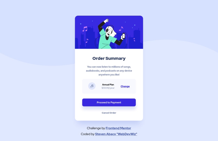
Design comparison
Solution retrospective
Hello fellow Developers,
This is my first challenge with Frontend Mentor. I singed up to practice my coding skills on real projects and have something to prove I've got the skills. Also to help out other developers on the same learning track.
I built this component using plain HTML and CSS. Built with Mobile First design process. Only added one @media query point at 768px.
If anyone has time to review and let me know what they think and any recommendations on improvement I would greatly appreciate it. I'm always interested in ways to improve and welcome any feedback from the community.
Thanks and looking forward to your feedback and comments!
Community feedback
- @jmnyaregaPosted about 3 years ago
Hi @stevenabaco you did very well on the challenge 👏👏. I have a few recommendations for you:
- Instead of
background-size: initial, you can have something likebackground-size:100vw 40vh`. - Look into relative units, using rem/ems enables users to resize fonts and sizes from their browsers.
Happy coding!
Marked as helpful1@stevenabacoPosted about 3 years ago@jmnyarega Thanks for your feedback.
Yes, I could have used the view port sizes but I decided to use 'initial' option since the original background svg had the fixed size I wanted to maintain as the max width even on larger screens. I didn't want the image being stretched passed that max size.
I use the 100vh option for the height all the time for landing pages which need to fill the entire screen on load.
Happy coding!
0 - Instead of
Please log in to post a comment
Log in with GitHubJoin our Discord community
Join thousands of Frontend Mentor community members taking the challenges, sharing resources, helping each other, and chatting about all things front-end!
Join our Discord
