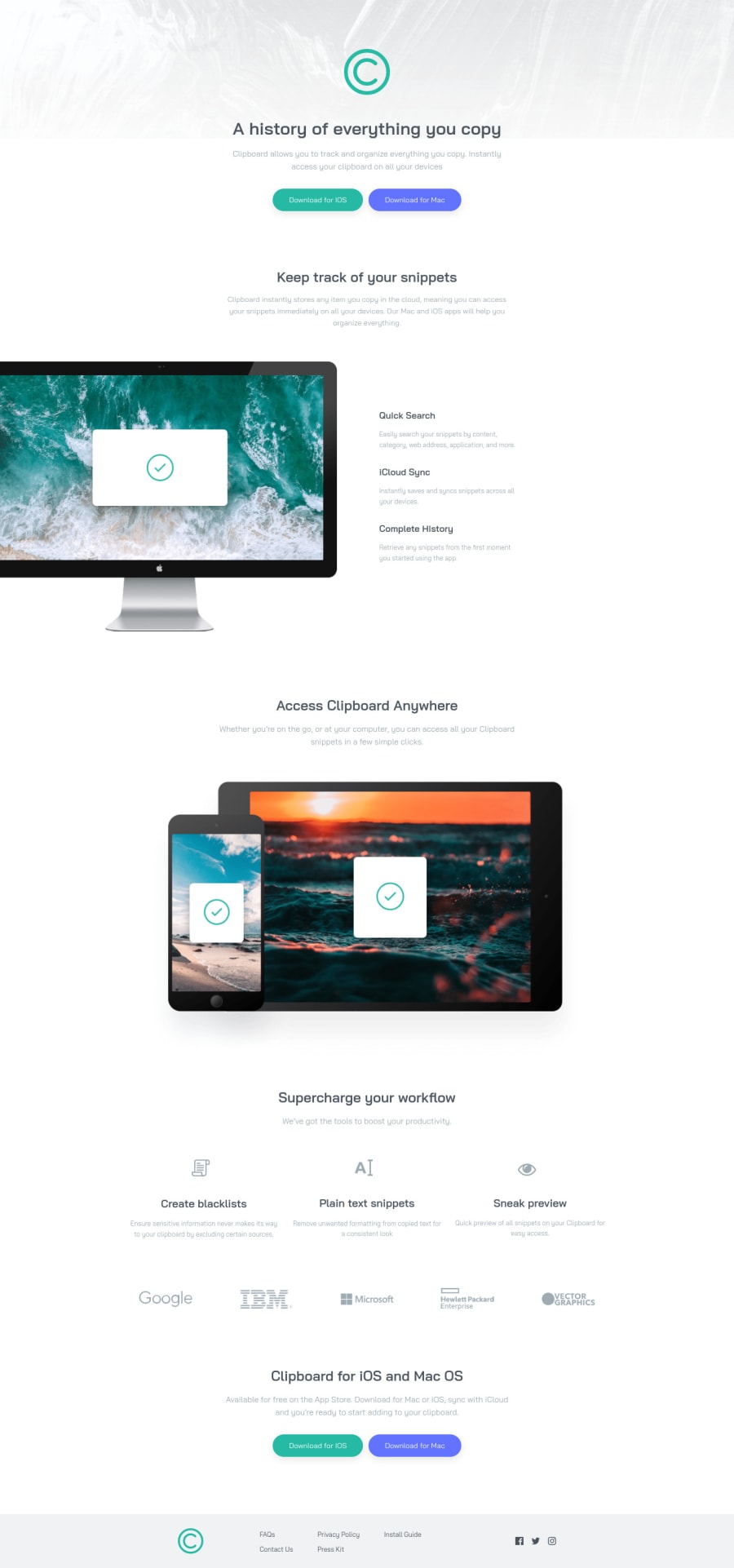
Mobile first using flexbox for layouts
Design comparison
Solution retrospective
I found this challenge quite difficult and taught me that I should plan the sections first before coding. The footer was particularly tricky. I just coded the two designs for their respective layouts.
Many thanks Steve
Community feedback
- @brasspetalsPosted almost 4 years ago
Hi, Steve! 👋
Congrats on completing your first “full-page” challenge! They're harder, but are great learning opportunities - and yes, planning DEFINITELY helps and is worth the time. I learned this one the hard way too! 😅 Your solution looks good and responds well overall. Here's some suggestions to improve your solution:
-
Your section usage is off here. A section should be for a whole block/area. For example, the full-width and hero sections should not be separate sections - all of that content is related to each other and goes together. While you might use different containing divs within the section to position content, the content should be together in one section. Another example would be that
.snippets
and.center-full
should also be together in one section, changing.center-full
to a containing div within.snippets
. Sections and semantic html can be tricky in general, so I highly suggest this article which I use all the time for reference. -
The logo shouldn’t shrink on the desktop version.
-
The icon-feature and vendor images get very large on medium layouts. I suggest changing the width to a set value instead of a percentage, or adding a
max-width
. A max-width might be useful for the single icon feature sections in general so that they don’t stretch too far on both medium and very large (i.e. 1920px) screens. -
Using a div inside a
ul
element, your .ul-flex divs in this case, is not allowed in html and is causing an error. I understand you wanted to do this in order to transition to multiple columns for the desktop layout. Instead I suggest looking into theflex-flow
property for theul
, or look into using grid. -
The text inside your footer
li
should be wrapped in anchor tags as they are links. Also, the hover states can be applied in the base css, and don’t need to be added for the desktop version only.
Hope this helps - happy coding!
1@stephentyers1975Posted over 3 years ago@brasspetals Thanks for your feedback and is in line with the fact I didn't really make a plan for the HTML:) the comments were very helpful. Cheers Steve
1 -
- @stephentyers1975Posted almost 4 years ago
Thanks for your feedback and is in line with the fact I didn't really make a plan for the HTML:) the comments were very helpful. Cheers Steve
0
Please log in to post a comment
Log in with GitHubJoin our Discord community
Join thousands of Frontend Mentor community members taking the challenges, sharing resources, helping each other, and chatting about all things front-end!
Join our Discord