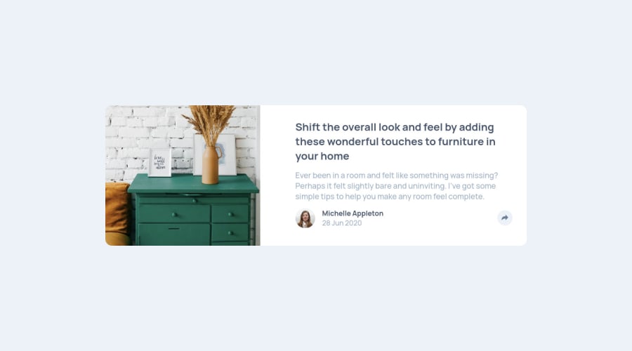
Mobile first using flexbox, and grid for centering, and JS
Design comparison
Solution retrospective
I really struggled with implementing CSS for pop ups on active state in this challenge. I ended up creating an absolutely positioned child element within a relatively positioned parent element. While this approach worked well, I felt it was more of a hack rather than a normal industry practice. I was wondering if anyone might know how these types of components/cards are designed in real life, eg is it OK to use something like Bootstrap to save time? My second question is about the best tool to use for the layout. I ended up using a little bit of Flexbox on some divs to help me with manipulating elements in an easier way, but I also used floats in mobile veiw. I tried using Grid and felxbox on the mobile layout and they simply didn't work due to fluid widths and heights of the elements in flexboxed divs or grid divs.
Community feedback
Please log in to post a comment
Log in with GitHubJoin our Discord community
Join thousands of Frontend Mentor community members taking the challenges, sharing resources, helping each other, and chatting about all things front-end!
Join our Discord
