Design comparison
Solution retrospective
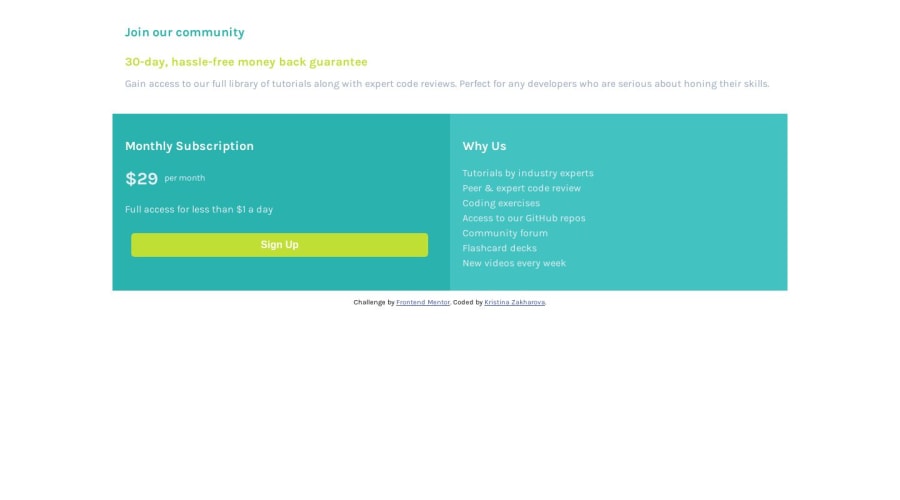
Hi! I'm super excited about this resource! It was my first time trying to create a layout based on the existing design and I didn't have a sketch file, so I kinda had to guess all the paddings and margins, but I would appreciate any feedback. I'm specifically interested in feedback on working with media queries, I wasn't sure what breakpoints I should use for the mobile-desktop transition. Also, any suggestions on what kind of instruments and techniques would be better to use are really appreciated!
Cheers, Kristina
Community feedback
- @safrukPosted over 4 years ago
And about the media queries you can set any number of media queries but ideally if you are working mobile first you can have media queries for tablet in portrait (600px - 900 px) tablet in landscape mode(901px - 1200px) and another for desktop (1200 and above)
Most people use single breakpoint for tablet views somewhere where design doesn't break through trial and error.Its absolutely fine. Depends what design you are looking for.
Personally I use media queries at 5 breakpoints as it works best for me at all times.Working mobile first
One for screens above 300.(min-width:300px)
screens above 600 (min-width:600px)
screens above 900 (min-width:900px)
screens above 1200 (min-width: 1200px)
And if you want to support really large desktops screens above 1800 (min-width:1800px)
1@safrukPosted over 4 years agoand if you work desktop first it would be similar but in the opposite way using max-width media queries. If you look at some examples of best solutions from people on frontend mentor you will get an idea. There are some really awesome solutions/ideas to pick from.
0 - @safrukPosted over 4 years ago
Hey Kristina .Nice job! Great progress for first try.
Maybe you could give a margin to the top most flex container(for mobile view) and fix its width for desktop view.Something like a max-width worked well for me on this challenge. You could give a border-radius as well for slightly rounded corners and add little bit of box-shadow to both the button and top most flex-container to get as close to the design as possible.Also I notice that you haven't added the background color of gray.
These are all minor fixes.Otherwise kudos.Well done.
1
Please log in to post a comment
Log in with GitHubJoin our Discord community
Join thousands of Frontend Mentor community members taking the challenges, sharing resources, helping each other, and chatting about all things front-end!
Join our Discord