Mobile first using Eleventy and Sass (with a CUBE CSS -ish) approach
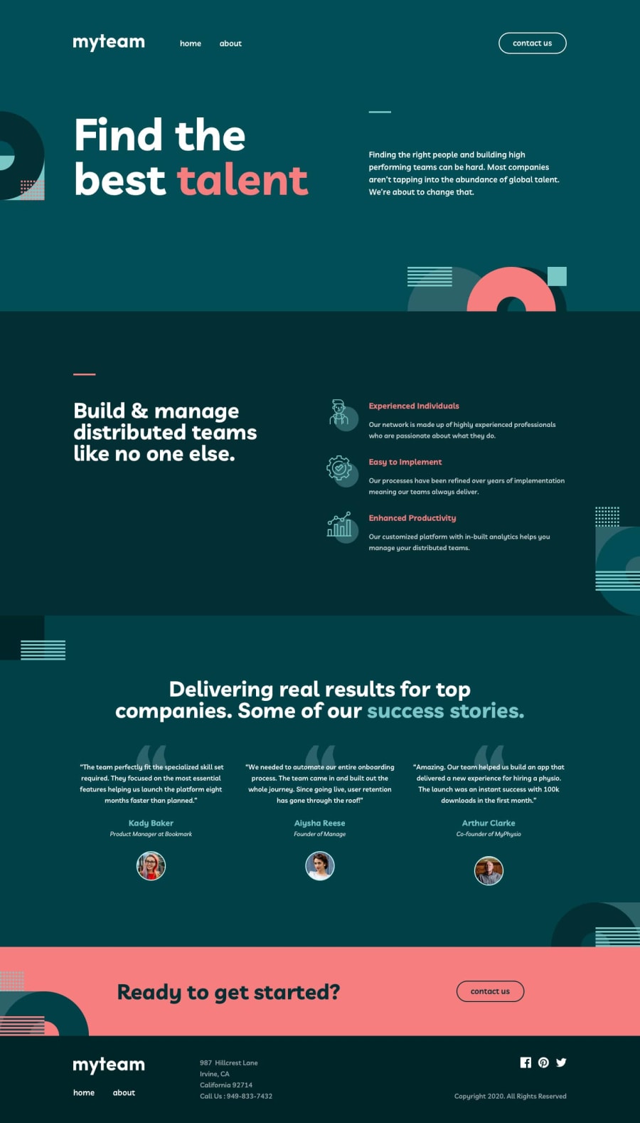
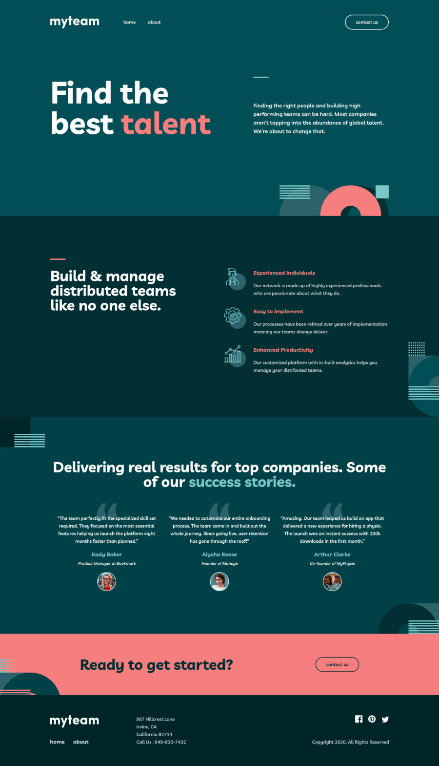
Design comparison
Solution retrospective
Hi!
I've used 11ty together with Andy Bell's CUBE CSS approach. I've been a general developer for a while now but I really want to improve my core frontend skills so any advice would be greatly appreciated. Anything from the structure of the CSS, refactoring templates, improving accessibility etc would be warmly welcomed :)
One thing I would like to look at more is some of the animations/transitions for the nav opening/directors boxes toggling/the form submitting.
Another thing that was a little difficult was going back to using vanilla js for the validation stuff instead of react. Not sure if my approach is very well structured but it seems to work at least.
Thanks in advance for any input!
Daryl
Community feedback
- @ApplePieGiraffePosted almost 4 years ago
Hey there, Daryl Carr! π
Congratulations on completing your first Frontend Mentor challenge! π I think you've done a great job on this challenge! π Both the home and about pages of your site look great and responds nicely! π
Maybe a tiny suggestion I might make is that you keep the desktop layout of the hero section of the home and about pages for a little longer (before transitioning to a mobile-friendly layout) so that there isn't too much empty space to the sides of the content when the layout first changes from desktop to mobile. π
Keep coding (and happy coding, too)! π
2@daryl-cPosted almost 4 years ago@ApplePieGiraffe - Hi.
Yer I understand what you mean about the whitespace. The layout change happens quite late so definitely could make the layout change earlier.
Thanks a lot for taking the time to have a look
1 - @RocTanweerPosted almost 4 years ago
Hello bro, You may wanna do 'resize : none' on your message field because its resizable and destroys your site...
One more thing is that I would suggest some transition when that + button is clicked in about section...
Hope it helps...
1@daryl-cPosted almost 4 years ago@RocTanweer Hi! Thanks for making me aware of the resize issue. I actually went with "resize: vertical" as it still gives those who want to write a longer message the ability to make it bigger to make it a better user experience.
And yer the transitions need some work! Thanks again :)
0 - @emestabilloPosted almost 4 years ago
Hi Daryl, I agree, your solution looks good! The only thing I noticed is that when you open the mobile menu, the
home
link is displaying its focus state. Not necessarily a negative, it's just something I haven't seen before :-) Great job!1@daryl-cPosted almost 4 years ago@emestabillo Hi thanks for the feedback.
Yes, I wasn't sure about the best way to handle this from "accessibility" (and I'm still not sure haha). The reasoning behind this was that I based it off of Heydon Pickering's Inclusive Components. In that article, he puts:
"Without a good method for directing users between elements, you should instead make sure one of the following is true:
- The expanded listβs first link is next in focus order after the button (as in the previous code example).
- The first link is focused programmatically upon revealing the list."
I guess number 1 works for me (Heydon says to prefer this) so I don't need to programatically focus to the first element so I'm going to change this.
Thanks for the feedback!
1 - @demahom18Posted almost 4 years ago
Hey Daryl, I find your solution really great. The only one thing you can do is adding a transition on your hover effects and it would be perfect
1@daryl-cPosted almost 4 years ago@demahom18 - Yes transitions and animations are something I need to improve. From your feedback, I added a hover affect to the director card buttons so that on hover they change colour and on click the plus turns into a cross.
Thanks again for the feedback!
0 - @DaniloMerelesPosted almost 4 years ago
Hi Dary, the work you did is great: D, but you should add a transition to the menu and remove the hover state from the hamburger button since there is no such state on mobiles and it only consumes resources. (My English is basic, if I misspelled sorry haha)
0
Please log in to post a comment
Log in with GitHubJoin our Discord community
Join thousands of Frontend Mentor community members taking the challenges, sharing resources, helping each other, and chatting about all things front-end!
Join our Discord