Design comparison
SolutionDesign
Solution retrospective
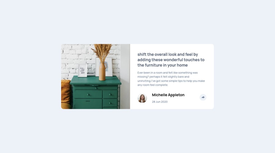
Hey guys I just finished these project .I didn't know how to create these small upside down triangle when the share icon is clicked on the desktop version so mine is a little different 1 so any comment on how I could have done that ? 2 I have to "row" classes with the same content on the html file .that hold the social media icons which I know it is not efficient but I didn't know how to manipulate the same class in different breakpoint through JavaScript
Community feedback
Please log in to post a comment
Log in with GitHubJoin our Discord community
Join thousands of Frontend Mentor community members taking the challenges, sharing resources, helping each other, and chatting about all things front-end!
Join our Discord
