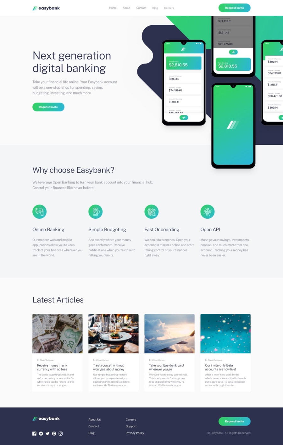
Mobile First - used CSS Flex-box, CSS Grid, Plain JS
Design comparison
Solution retrospective
I had hard time with positioning background images of the first section - showcase block). Mobile view looks ok but desktop view is quite tricky on different resolutions. It is hard to position so these background images looks good on any desktop resolution. Still I'm not happy with the solution that I made because it is quite different from the design. I would be grateful for any help with this issue.
Community feedback
- @OlehTovkaniukPosted about 4 years ago
Also I would like to notice that the screenshot of the site in the design comparison somehow is not correct. Those buttons that were shown broken in the screenshot in real are looking correctly. You can see it by the link "PREVIEW SITE"
0
Please log in to post a comment
Log in with GitHubJoin our Discord community
Join thousands of Frontend Mentor community members taking the challenges, sharing resources, helping each other, and chatting about all things front-end!
Join our Discord
