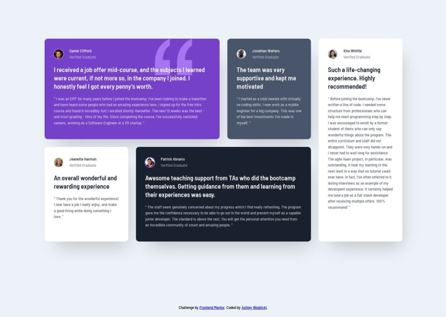
Design comparison
Solution retrospective
I would like feedback on the text wrapping in my design. I calculated the padding for each testimonial block at 30px, but the text is not wrapping exactly like the design images. I tried changing the padding and letter-spacing and nothing would produce the exact line breaks. Is there something I am missing?
Community feedback
- @buneeIsSloPosted almost 4 years ago
In my opinion, This is as close as you can get to the actual design. If you still wish to make the page pixel perfect... Maybe try tweaking the width of
content-wrap? And also thisbox-shadow: 18px 37px 57px -22px rgba(0, 0, 0, 0.2);is a more accurate box-shadow. Hope this helps :)Marked as helpful0@alwodzickiPosted almost 4 years ago@buneeIsSlo Thank you for your feedback. I overlooked the box-shadow and need to read more about it, so I appreciate the code and the reminder :)
1
Please log in to post a comment
Log in with GitHubJoin our Discord community
Join thousands of Frontend Mentor community members taking the challenges, sharing resources, helping each other, and chatting about all things front-end!
Join our Discord
