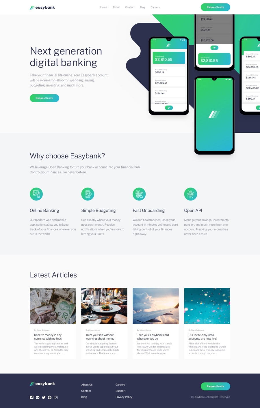
Design comparison
Solution retrospective
I was wondering how you approach the media queries. Lets say you do mobile first, do you set the margins for the small devices directly without a media querie and then overwrite it inside a media query for desktops later if needed?
Or is there a better way? Thanks for help.
Greetings Martin
Community feedback
- @AmossenkaoPosted about 2 years ago
Personally I always do mobile first because I find it easier. With mobile devices, you don't really have to move things around a lot because most of the time you'll only need a single column layout, which is the default in the html.
This means that the overall mobile layout can be achieved with little code. However, if you do desktop first, it most likely you'll take some elements out of the document flow(using positioning or floats) and it will be needlessly challenging to get them back once you're making it responsive to mobile.
1
Please log in to post a comment
Log in with GitHubJoin our Discord community
Join thousands of Frontend Mentor community members taking the challenges, sharing resources, helping each other, and chatting about all things front-end!
Join our Discord
