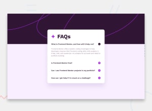
Design comparison
Solution retrospective
I'm still proud to have completed this challenge, continuing my positive momentum.
What challenges did you encounter, and how did you overcome them?Using the Details and Summary html elements and customizing them required a certain amount of effort, which I was able to overcome with patience and th goods resources. Managing the distortion of the background according to the width of the device also required a little revision of the way the Css properties background-size and background-position work.
What specific areas of your project would you like help with?I had to limit the size of the content of the Html Summary element so that the icon would be visible. I thought I could get away with a simple
.childOfSummary{
display: flex;
justify-content: space-between;
}
But the icon more or less popped out of the parent div without me really understanding why. After several attempts, I ended up arbitrarily limiting the size of the content of the Html Summary element to leave enough space for the icon.
Community feedback
- @AReactDeveloperPosted 3 months ago
good work i really like the animation on the button
1
Please log in to post a comment
Log in with GitHubJoin our Discord community
Join thousands of Frontend Mentor community members taking the challenges, sharing resources, helping each other, and chatting about all things front-end!
Join our Discord
