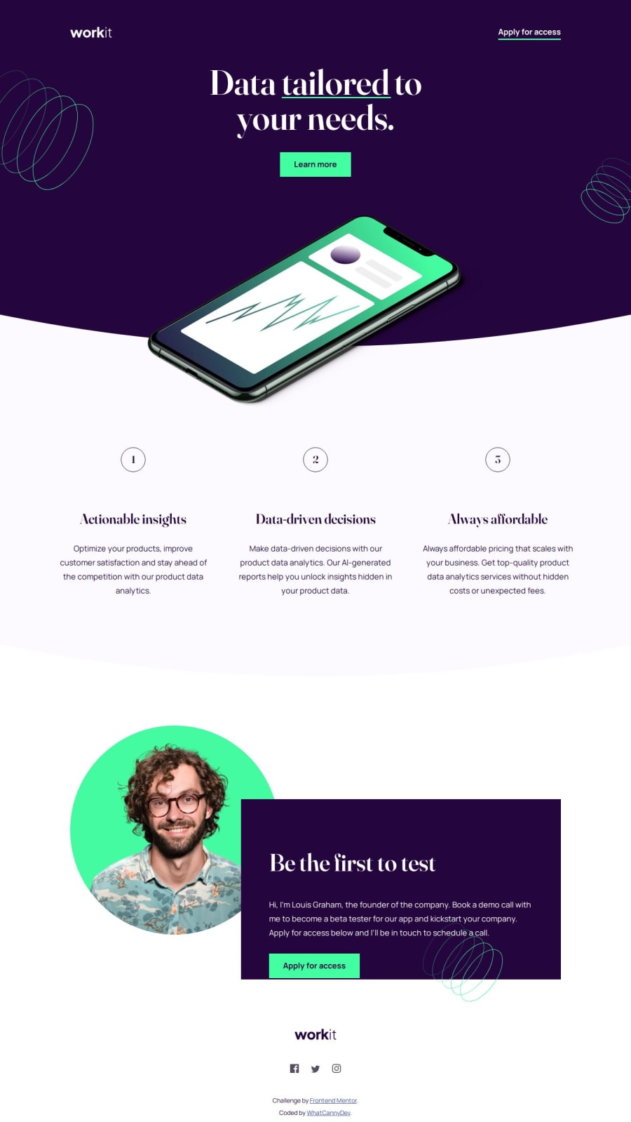
Design comparison
Solution retrospective
I've finally come up with a solution that satisfies me. After doing and undoing each Css class a hundred times to get it right. I'm proud not to have given up. If I had to change something in my approach, I'd try to sit down before starting and think more about the project organization, containers, divs, etc...
What challenges did you encounter, and how did you overcome them?It may sound silly, but using a variable font and configuring it in css so that it perfectly matches the characteristics of the model. I first thought of using the static font available in the Kit but it didn't match the design perfectly... then I found the perfect static version available online but preferred to persevere and use the variable font directly. Thanks to the fonts.google.com page which explains how to do it very well.
What specific areas of your project would you like help with?For managing backgrounds with curves or patterns in SVG, I used the ::before and ::after approach to create contents that I used as a basis for making giant circles or “filters” on which to position images. I'm very curious about other ways of solving this that are simpler and/or more efficient.
Community feedback
Please log in to post a comment
Log in with GitHubJoin our Discord community
Join thousands of Frontend Mentor community members taking the challenges, sharing resources, helping each other, and chatting about all things front-end!
Join our Discord
