Submitted 11 months ago
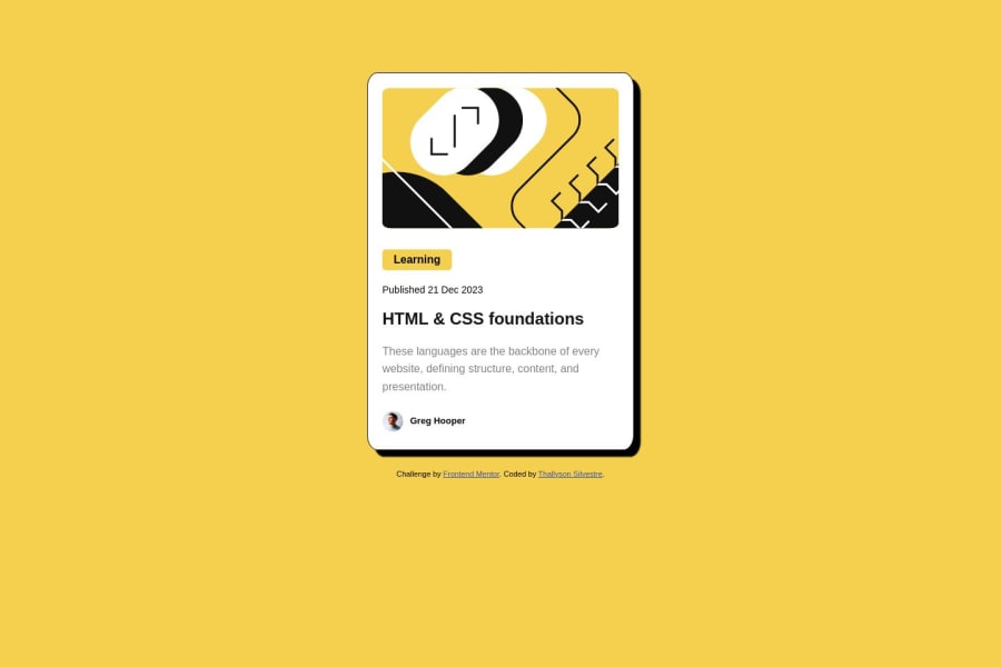
Mobile first solution using HTML and CSS Grid and Flexbox
@t-silvestre
Design comparison
SolutionDesign
Community feedback
- @zarakPosted 25 days ago
This looks great - I love the hover effect on the entire card!
You might be able to organise your CSS slightly better by using variables for things like colours and spacing. The solution looks quite similar to the design. You didn't neglect to include the solid border on the card like I did, so you definitely have an eye for detail. Great work!
0
Please log in to post a comment
Log in with GitHubJoin our Discord community
Join thousands of Frontend Mentor community members taking the challenges, sharing resources, helping each other, and chatting about all things front-end!
Join our Discord
