Submitted over 4 years ago
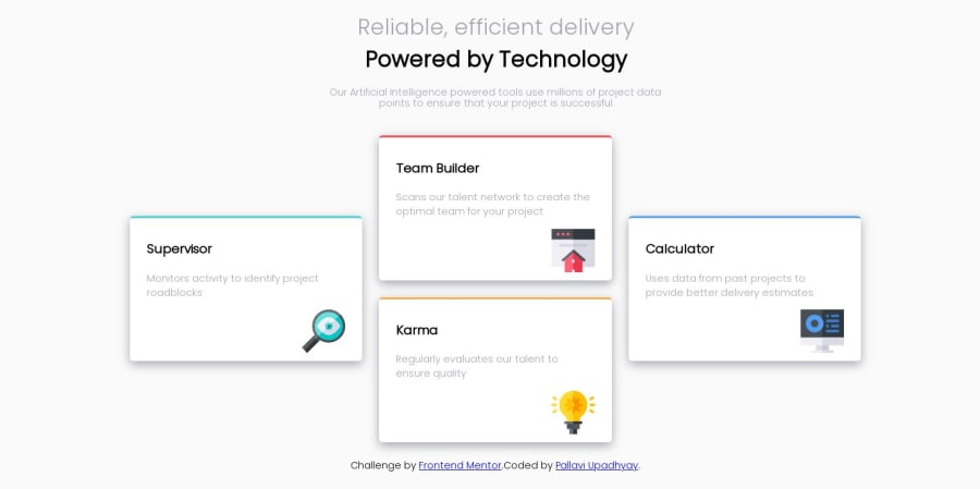
Mobile first solution using HTML and CSS Flex and Gridbox
@pallavi-1812
Design comparison
SolutionDesign
Community feedback
- @boallanPosted over 4 years ago
Looking good. The colored borders can be tricky to get just right, but you hit it perfectly.
You should add a max-width to keep the design from stretching too much when viewing on large monitors. And the design breaks a little somewhere between 600px-1000px, stacking the boxes in that range would give a better design, and it can be fixed by adjusting a single media-query.
1@pallavi-1812Posted over 4 years ago@boallan Thanks a lot for such a helpful feedback!
0
Please log in to post a comment
Log in with GitHubJoin our Discord community
Join thousands of Frontend Mentor community members taking the challenges, sharing resources, helping each other, and chatting about all things front-end!
Join our Discord
