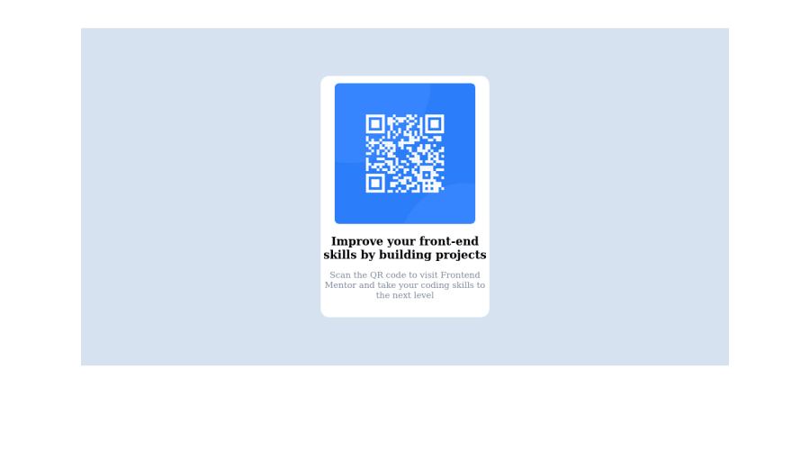
Design comparison
Solution retrospective
my first Frontend mentor challenge.. corrections is highly welcome.
what do you think I need to improve on?
Community feedback
- @HassiaiPosted over 1 year ago
Replace <h3> with <h1> to fix the accessibility issue.
Every html must have <h1> to make it accessible. Always begin the heading of the html with <h1> tag wrap the sub-heading of <h1> in <h2> tag, wrap the sub-heading of <h2> in <h3> this continues until <h6>, never skip a level of a heading
There is no need to style the main. Give its background-color to the body.
To center .container on the page using flexbox or grid instead of margin and postion: relative, , add min-height:100vh; display: flex; align-items: center: justify-content: center; or min-height:100vh; display: grid place-items: center to the body.
USING FLEXBOX:
body{
min-height: 100vh;
display: flex;
align-items: center;
justify-content: center;
}
USING GRID: body{ min-height: 100vh; display: grid; place-items: center; }Give h1 and p the same font-size of 15px which is 0.9375rem, text-align: center,the same margin-left, margin-right and margin-top values. Give p a margin bottom value.
For a responsive content which wont require a media query for this challenge:
- Give .container a fixed max-width value and a padding value for all the sides.
max-width: 320px padding:16px. - Give the img a max-width of 100% and a border-radius, the rest are not needed.
Use relative units like rem or em as unit for the padding, margin, width values and preferably rem for the font-size values, instead of using px which is an absolute unit. For more on CSS units Click here
Hope am helpful.
Well done for completing this challenge. HAPPY CODING
0 - Give .container a fixed max-width value and a padding value for all the sides.
- @Daniel-BilodidPosted over 1 year ago
Hi, my congratulations you did a great job 🎉
𝐒𝐨𝐦𝐞 𝐭𝐢𝐩𝐬 𝐟𝐨𝐫 𝐲𝐨𝐮𝐫 𝐜𝐨𝐝𝐞 🛠
🔹 About text
You can add a width to the h3 and p text to compress it
🔹 About background
You can add a width of 100vw and a height of 100vh, check this article
I hope it was helpful, you are great, keep up the good work 👍
0 - @Cyber-BorriesPosted over 1 year ago
Great submission, dev-unicity!
Some things to consider:
- Keep stylesheets in separate folders and link to the stylesheet from your HTML's head like:
<link rel="stylesheet" href="yourStyleSheet.css"> - You can use Google fonts to use different fonts - which was part of the requirements for this challenge.
Try and train your eye to see where you should add some padding or margin. Read up about the CSS box-model to see how content, margin, padding and borders work together.
Overall, a great submission. Keep up the good work!
0 - Keep stylesheets in separate folders and link to the stylesheet from your HTML's head like:
Please log in to post a comment
Log in with GitHubJoin our Discord community
Join thousands of Frontend Mentor community members taking the challenges, sharing resources, helping each other, and chatting about all things front-end!
Join our Discord
