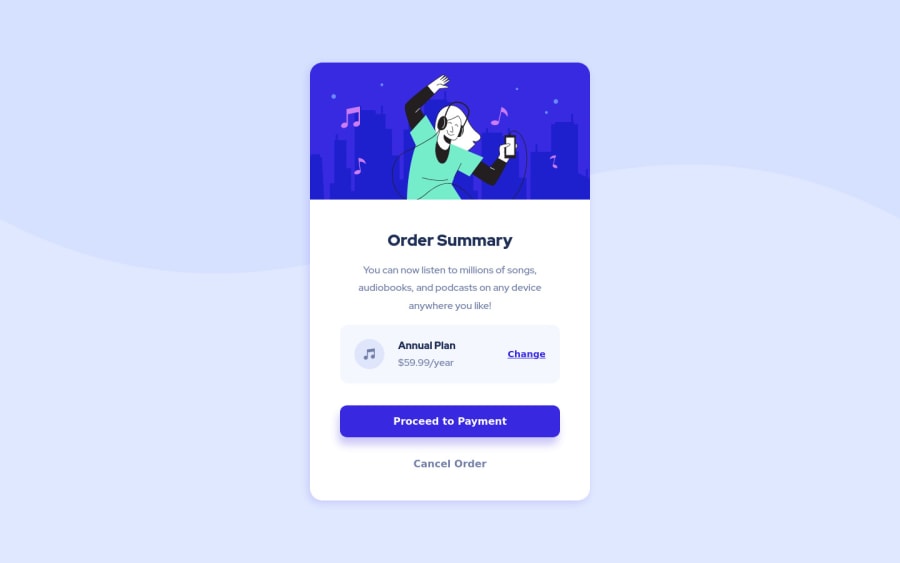


Design comparison

Community feedback
- @correlucasPosted about 2 years ago
👾Hi @chegx, congrats on completing this challenge!
Great solution and great start! By what I saw you’re on the right track. I’ve few suggestions to you that you can consider to add to your code:
To make your solution even better and more responsive, you can create a media query to break the elements in the
pricing sectionafterwidth: 350pxand make every content in a different row, saving space for low resolution devices.@media (max-width: 350px) { .plan-box { display: flex; align-items: center; justify-content: center; flex-direction: column; } }✌️ I hope this helps you and happy coding!
Marked as helpful1@chegxPosted about 2 years ago@correlucas thank you for your feedback!
The card looks quite neat with viewport 300 px wide. Are there many devices with screen smaller than that?
0@correlucasPosted about 2 years ago@chegx Indeed its fine, but if you want to make your solution super responsive this is the way. I liked to make the maximum possible in my solutions, this is why I suggest Cheg. But anyway your solution is working yet.
1

Please log in to post a comment
Log in with GitHub
Join our Discord community
Join thousands of Frontend Mentor community members taking the challenges, sharing resources, helping each other, and chatting about all things front-end!
Join our Discord